App Splash Screen vs. Onboarding Screen: What's the Difference?
You've just downloaded a shiny new app. Before you can actually use it, two things happen: a quick branded screen flashes for a couple of seconds, and then — maybe — a series of slides walks you through what the app does and asks you to set up your account.
Both of those moments have names. And surprisingly, a lot of designers, product managers, and developers mix them up — or worse, treat them as the same thing. They're not.
Getting these two elements right (or wrong) has a real impact on user retention. According to research by Localytics, apps lose around 25% of users after just one session. A clunky or confusing first few screens is a big reason why.
This guide will walk you through exactly what a splash screen is, what an onboarding screen is, how they work together, and — most importantly — how to make both of them work for you.
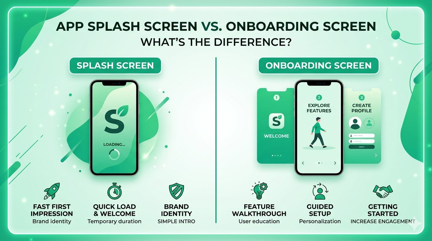
What Is a Splash Screen?
Think of a splash screen as your app's curtain call before the show starts. It's that brief, branded moment users see while your app is loading in the background.
The Basics
- It's a loading screen in disguise — its primary job is to give users something to look at while the app initialises assets, checks authentication, or fetches initial data
- It's short-lived — typically between 1–3 seconds; anything longer starts to feel like a loading problem, not a design choice
- It's brand-focused — usually shows your app logo, name, or a simple brand colour — nothing more
- It's not interactive — users can't tap anything; they just wait
- It's technically required on some platforms — iOS, for example, requires a launch screen as part of App Store guidelines
What Goes on a Splash Screen?
| Element | Include? | Notes |
|---|---|---|
| App logo | ✅ Yes | Keep it centred and clean |
| Brand colour background | ✅ Yes | Should match your app's visual identity |
| Tagline or slogan | ⚠️ Maybe | Only if it's very short and adds meaning |
| Login / signup buttons | ❌ No | That's for onboarding |
| Animations | ⚠️ Maybe | Keep them under 1 second and purposeful |
| Loading progress bar | ⚠️ Sometimes | Useful for heavy apps like games |
The Technical Side (for the Curious)
- On iOS, the splash screen is called a Launch Screen and is defined in Xcode using a storyboard or asset catalog
- On Android, it's implemented via a dedicated
SplashScreenAPI (introduced in Android 12) or a themed activity - On React Native or Flutter, third-party packages like
react-native-splash-screenhandle the implementation
What Is an Onboarding Screen?
If the splash screen is the curtain call, onboarding is the opening act. It's the experience that guides a brand-new user from "I just downloaded this app" to "okay, I get it — and I want to keep using it."
The Basics
- It's an educational or setup experience — it explains what the app does, what value it offers, or helps users configure their preferences
- It's multi-step — typically 3–7 screens (or more, depending on complexity)
- It can be interactive — swipe carousels, input fields, permission prompts, personalisation questions, and progress indicators are all fair game
- It only appears once — at least the first-time-user flow; some apps offer an optional revisit from settings
- It directly impacts activation — this is where users decide whether the app is worth their time
Types of Onboarding Flows
1. Benefit-Focused Onboarding
- Highlights the top 3–5 features or value propositions
- Uses illustrations or short animations alongside short copy
- Best for apps where the value isn't immediately obvious (e.g. productivity, finance, health)
- Example structure: "Here's what you can do" → "Here's why it matters" → "Let's get started"
2. Setup / Permissions-Focused Onboarding
- Walks users through account creation, notification permissions, location access, etc.
- Explains why each permission is needed (critical for trust)
- Best for apps that require significant setup before they're useful (e.g. delivery apps, fitness trackers)
- Tip: ask for permissions at the moment of context, not all at once
3. Personalisation-Focused Onboarding
- Asks users questions to tailor their experience ("What are your goals?", "What topics interest you?")
- Makes users feel like the app was made for them
- Best for content platforms, learning apps, and recommendation engines
- Tip: keep it to 3–5 questions max — people don't want to fill out a survey before using an app
4. Interactive / Try-Before-You-Sign-Up Onboarding
- Lets users experience core features before asking them to create an account
- Increasingly popular because it reduces signup friction
- Best for apps where the experience itself is the hook (e.g. design tools, games, meditation apps)
Splash Screen vs. Onboarding Screen: Side-by-Side Comparison
Here's where it all comes together. At a glance:
| Feature | Splash Screen | Onboarding Screen |
|---|---|---|
| Purpose | Brand/loading moment | Educate and activate users |
| Duration | 1–3 seconds | User-controlled (minutes) |
| Interactivity | None | High |
| Appears | Every app open (or first launch only for some) | First launch only |
| Content | Logo, brand colour | Features, setup, permissions, value props |
| Goal | Keep users from staring at a blank screen | Convert new users into engaged users |
| Skip option | N/A | Often yes — and you should offer one |
| Can be skipped entirely? | No (required on most platforms) | Yes — some apps drop it if UX is self-evident |
The Critical Distinction
Here's the thing people get wrong: the splash screen is not part of onboarding. It happens before onboarding. And it should feel completely separate.
A splash screen that tries to double as onboarding — stuffing in feature callouts or a "welcome" message — just creates a confusing, cluttered experience. Likewise, an onboarding screen that lingers too long starts to feel like a loading screen with extra steps.
Give each element one job. Do that job well. Move on.
Common Mistakes & Pitfalls
Even experienced teams get these wrong. Here are the most common offenders:
Splash Screen Mistakes
- Making it too long — if your splash screen lasts more than 3 seconds, users assume the app is broken or slow. Optimise your app's initialisation instead of padding the splash
- Using it as an ad — some apps show promotional banners on the splash screen. This is a fast way to annoy users before they've even seen the app
- Static design with no brand connection — a white screen with a small icon tells users nothing about who you are; use brand colours and typography consistently
- Forgetting dark mode — if your app supports dark mode, your splash screen should too; a blinding white screen on a dark-mode device is jarring
- Animating for too long — a 3-second logo animation on every single app open gets old very quickly
Onboarding Mistakes
- Too many screens — 10+ onboarding slides is a gauntlet, not a welcome; users will tap "skip" faster than you can say "feature highlight"
- Feature-dumping — listing every single feature the app has is not onboarding; focus on the 2–3 things that will make users stay
- Asking for permissions without context — demanding camera, location, and notification access on screen one, without explaining why, will get your requests denied every time
- No skip option — forcing users through onboarding they don't want builds resentment, not engagement; always offer a way out
- Generic copy — "Welcome to [App Name]!" on screen one is wasted space; lead with the user's benefit, not your app's name
- Reappearing on every launch — showing onboarding every time the app opens is a bug, not a feature; store completion state properly
Expert Tips & Best Practices
You've got the fundamentals down. Here's how to take both screens to the next level.
Splash Screen Best Practices
- Match your splash screen to your in-app design system — fonts, colours, and iconography should feel like a seamless extension of the app, not a separate identity
- Use native implementations where possible — platform-native splash screens (iOS Launch Screen, Android SplashScreen API) are smoother and more reliable than custom JavaScript-layer solutions
- Keep animations purposeful — if you animate your logo, make sure it ties into the brand personality; a meditation app should animate calmly, a gaming app can be punchy
- Test on real devices — splash screens behave differently on older hardware; always QA on low-end Android devices especially
- Consider adaptive icons and assets — on Android, use adaptive icons so your splash screen looks right across different launcher shapes and screen densities
Onboarding Best Practices
- Lead with value, not features — "Track your runs, crush your goals" beats "Our app has GPS tracking and route history"
- Use progressive disclosure — don't explain everything upfront; reveal complexity as users need it
- Add a progress indicator — even a simple "2 of 4" or a dot carousel reduces abandonment by giving users a sense of an end point
- A/B test your onboarding — small copy changes or reordering screens can meaningfully impact completion rates and Day-7 retention
- Personalise where you can — even simple personalisation ("What brings you here today?") makes users feel seen and increases the likelihood they'll complete setup
- Gate the minimum, not the maximum — only ask for what you absolutely need at signup; get users to value first, then ask for more
- Re-onboard after major updates — if you ship a significant feature, consider a lightweight "what's new" flow, not a full repeat of onboarding
Real-World Examples & Case Studies
Duolingo — Personalisation-First Onboarding
Duolingo's onboarding is a masterclass in progressive personalisation. Before you sign up for an account, the app asks which language you want to learn, your motivation for learning it, your daily goal, and your current level. By the time you're asked to create an account, you've already started your first lesson — you're invested. The splash screen is minimal: a green background, the owl logo, done. No fuss.
Slack — Permission-in-Context Onboarding
Rather than front-loading all permissions, Slack requests notification access at the moment it becomes relevant — after you've joined a workspace and are about to receive your first message. This contextual approach to permissions consistently yields higher acceptance rates than upfront mass-requesting.
Headspace — Benefit-Led Storytelling
Headspace's onboarding doesn't start with features. It starts with emotions: "What brings you to Headspace?" Users pick from options like "Reduce stress," "Sleep better," or "Be more mindful." The experience then tailors its welcome journey accordingly. The splash screen is calm, on-brand (orange gradient, minimal logo), and brief.
Instagram — Minimal Onboarding
Instagram's onboarding is deliberately short. Sign up, choose a username, optionally follow some accounts, and you're in. Instagram knows its core experience (scrolling a feed) is intuitive enough to teach itself — so it doesn't over-explain. This is a good reminder that onboarding length should match the complexity of your app, not a template.
FAQs
1. Do I need both a splash screen and an onboarding screen?
Not necessarily. A splash screen is effectively required on mobile platforms (iOS mandates a launch screen, Android strongly recommends one). Onboarding, however, is optional — if your app's interface is self-explanatory (like a simple calculator or flashlight app), you can skip it entirely. Add onboarding only if new users genuinely need guidance to get value from your app.
2. Should the splash screen appear every time the app opens, or only on first launch?
It depends on your implementation. On iOS and Android, the system-level launch screen appears every time the app cold-launches (i.e. when it's not already in memory). Onboarding, however, should only appear on first launch. Make sure you're storing a flag (e.g. in local storage or a database) so onboarding doesn't repeat for returning users.
3. How many screens should my onboarding flow have?
The sweet spot for most apps is 3–5 screens. Research and industry benchmarks consistently show that completion rates drop sharply beyond 5–6 screens. If you have a lot to cover, consider breaking onboarding into phases: a short first-launch flow, then contextual tips surfaced in-app over the first week.
4. Should I offer a "Skip" button on onboarding?
Yes, almost always. Some users are returning users who reinstalled the app, or power users who just want to get in. Forcing everyone through onboarding creates friction for these people. The exception is setup steps that are technically required for the app to function — like connecting an account or granting a core permission — where "skip" would break the experience.
5. Can I use the splash screen to check login status and redirect users?
Yes — and this is actually a common and perfectly valid pattern. Many apps use the splash screen window (while the app initialises) to check whether the user is already logged in, and then route them either to the home screen (logged in) or to the login/onboarding flow (not logged in). Just make sure this logic runs fast; don't artificially extend the splash screen to complete these checks.
6. What's the difference between onboarding and a walkthrough / tooltip tour?
Onboarding typically refers to the first-launch experience before the user reaches the main app interface. A walkthrough or tooltip tour is an in-app guide that appears within the main UI, often highlighting specific elements with popovers or highlights. Both are valid tools, but they serve different moments — onboarding sets context before the user is in the app; walkthroughs assist users once they're already exploring.
7. Does a better splash screen or onboarding actually improve retention?
Onboarding has a well-documented impact on activation and early retention. According to data from Appcues, users who complete onboarding are significantly more likely to become activated users — meaning they reach the "aha moment" that makes them want to return. Splash screens, by contrast, have minimal direct impact on retention — their job is purely functional. But a jarring or broken splash screen (one that flashes the wrong colours or takes too long) creates a bad first impression that's hard to recover from.
Conclusion
Let's bring it home. Here's the short version:
- Splash screen = loading moment. It's brief, branded, and non-interactive. Its job is to fill dead air while your app wakes up — not to teach users anything.
- Onboarding screen = welcome journey. It's multi-step, interactive, and educational. Its job is to get users to their first "aha moment" as fast as possible.
- They work in sequence, not in tandem. Splash comes first. Onboarding follows. Neither should try to do the other's job.
- Both should be intentional. A 5-second splash screen with a spinning logo is a bad experience. A 12-screen onboarding that lists every feature is exhausting. Keep both lean, purposeful, and on-brand.
Key Takeaways
| Splash Screen | Onboarding | |
|---|---|---|
| Primary function | Fill loading time | Drive user activation |
| Length | Seconds | Minutes |
| Required? | Effectively yes | Only if needed |
| Appears how often | Every cold launch | First launch only |
| Success metric | App load time | Day-1 / Day-7 retention |
Your Next Steps
- Audit your current splash screen — does it load fast, look on-brand, and support dark mode?
- Map your onboarding flow — write down every screen, what it asks or teaches, and whether it's truly necessary
- Kill the fluff — remove any onboarding screen that doesn't directly help users reach their first moment of value
- Set up analytics — track where users drop off in onboarding; that's your biggest opportunity for improvement
- Test and iterate — run A/B tests on copy, screen order, and length; small changes here compound into meaningful retention gains
Getting these two elements right won't make your app successful on its own — but getting them wrong is one of the fastest ways to lose users before they ever see what makes your app great. Start there, and you're already ahead of most of the competition.
Have questions about designing your app's first-launch experience? Start by reviewing Apple's Human Interface Guidelines on launch screens and Google's Material Design onboarding patterns — both are regularly updated and free to access.