What Is a Splash Screen and How Should I Get One in 2026?
You tap an app. Before anything else appears — before the home feed, the dashboard, the login form — a logo fills your screen for a brief moment. Then the app opens.
That moment is a splash screen. It lasts about a second, most people never consciously notice it, and it's doing a lot more work than it looks like.
Here's the thing: most developers and business owners either skip it entirely or get it badly wrong. Too long, too cluttered, or broken in a way that makes the app look like it just crashed. Both scenarios hurt retention in the first few seconds of the user experience.
This guide covers what a splash screen actually is, why it still matters in 2026, what the current platform rules require, and the clearest path to getting one — whether you're a solo founder, a designer, or a developer writing native code.
What Is a Splash Screen?
The Simple Definition
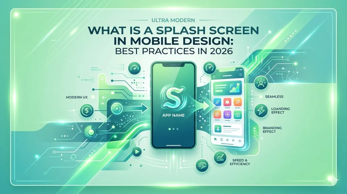
A splash screen (also called a launch screen) is the first visual a user sees when they open an app. It appears while the app initialises in the background — before the real UI is ready to display.
It's typically full-screen, lasts one to three seconds, and shows your logo, brand name, or a simple animation on a solid background colour.
A few things it is not:
- An onboarding screen — that's the walkthrough new users see after they log in for the first time. It educates; the splash screen just introduces. Check detailed difference between splash screen and onboarding screen.
- A loading screen — that appears mid-session when content is being fetched. The splash is purely about app startup.
A good analogy: it's the curtain rising before a theatre show. The performance isn't ready yet, but the curtain itself tells you exactly where you are.
A Brief Origin Story
Splash screens started in desktop software back in the 1990s. Adobe Photoshop used one to hide its notoriously slow startup times — rather than stare at a blank window, you'd see a branded image while everything loaded behind the scenes.
Mobile platforms picked up the pattern early on. Apple originally called it a "launch image" before formalising the concept in the LaunchScreen storyboard format.
The real turning point for mobile came with Android 12 (API level 31) in 2021. Google baked splash screens directly into the operating system — making them a platform feature rather than just a developer choice. By 2026, splash screens are semi-mandatory on Android and expected by convention on iOS. Skip one, and your app can feel broken on cold launch.
Types of Splash Screens
Static Splash Screens
The classic approach: one fixed image, your logo, your background colour. Nothing moves.
It's the most common type for a reason — it renders instantly, works everywhere, and never gets in the way. Banking apps, productivity tools, and most well-retaining apps use this.
The only drawback is that a poorly designed static screen can look dated. But a clean, well-branded static screen will always outperform a slow animated one. Speed beats spectacle, every time.
Animated Splash Screens
These include a short animation — a logo pulse, a scale-up reveal, a line-draw effect. Done well, they add polish. Done badly, they add delay.
A few things to know:
- Android 12+ natively supports animated vector drawables (AVDs) on the splash screen.
- iOS supports Lottie animations via third-party libraries, but not natively in LaunchScreen.storyboard.
- The animation must finish before the 1.5-second threshold — not drive the duration past it. Never let the animation decide when the screen dismisses.
Adaptive / System-Generated Splash Screens
On Android 12+, if you do absolutely nothing, the OS automatically generates a splash screen using your app's adaptive icon on a white or themed background. On iOS 15+, you're required to provide a LaunchScreen.storyboard — even a simple one is fine.
These defaults are often good enough for early-stage MVPs. The trade-off is limited brand control. With a bit of effort (theming attributes on Android, named colors in iOS asset catalogs), you can override the background colour and icon animation without building a fully custom implementation.
Web Splash Screens (PWAs)
Progressive Web Apps can simulate a splash screen using the Web App Manifest — specifically the background_color, theme_color, and icons fields. When a user adds your PWA to their home screen, Chrome for Android auto-generates a splash from these values.
Safari on iOS works differently. It generates a splash from apple-touch-icon and apple-mobile-web-app-status-bar-style meta tags, and it does not read from the Web App Manifest. You have to handle the two platforms separately.
The honest caveat: web splash screens give you less design control than native. They're generated by the OS, not rendered from a custom asset you've designed pixel by pixel.
Why Splash Screens Still Matter in 2026
The Retention Angle
The numbers are unambiguous. Apps with splash screens longer than two seconds see roughly 8% user abandonment at launch. Push past three seconds and that figure climbs to approximately 12%.
Flip that around: a well-timed splash under 1.5 seconds can actually improve perceived performance — users feel like the app is fast even when it hasn't finished loading yet. This phenomenon has a name: perceived performance, and it's one of the most underrated levers in mobile UX.
The takeaway is a little paradoxical: the splash screen is both a UX problem to minimise and a branding moment to own. The best implementations do both at once.
Brand Imprinting
Users form a first impression in under 50 milliseconds. The splash screen is the only screen that's guaranteed to appear on every single cold launch — which makes it unique real estate.
A consistent logo and brand colour, shown briefly and cleanly, reinforces recall without the user consciously processing it. This is especially valuable for white-label apps or products competing in crowded categories where differentiation is hard.
Masking Cold Start Latency
This is the splash screen's actual job, even if nobody talks about it that way.
Apps don't start instantly. The OS has to spin up the runtime, allocate memory, and initialise services. Without a splash screen, users see a blank white or black flash — which looks exactly like a crash.
The splash screen covers that initialisation gap gracefully. On Android 12+, this is now enforced at the platform level: every app shows a splash screen, full stop, whether the developer configured one or not.
Platform-Specific Rules for 2026
Android: The Splash Screen API (API 31+)
Since Android 12, the SplashScreen API is the only supported approach. The old SplashActivity pattern — where you'd create a dedicated Activity just to show a splash — is officially discouraged.
For devices below API 31, use the androidx.core:core-splashscreen compatibility library.
Critical mistake to avoid: do not use Handler.postDelayed() or Thread.sleep() to extend the splash artificially. Both block the main thread and risk ANR (Application Not Responding) crashes.
The correct approach is to use splashScreen.setKeepOnScreenCondition {} tied to your ViewModel's loading state. The splash stays visible as long as initialisation genuinely requires it — and not a millisecond longer.
Size specs for Android adaptive icons on the splash:
| Element | Spec |
|---|---|
| Brand image | 160 × 160 dp |
| App icon with background | 240 × 240 dp (centred in a 160 dp circle) |
iOS: LaunchScreen.storyboard
Apple deprecated static launch image assets in Xcode 13. As of 2026, LaunchScreen.storyboard is required for all App Store submissions. No exceptions.
A few rules to follow:
- The storyboard must use auto-layout constraints so it scales across every screen size, from iPhone SE to iPad Pro.
- Don't include any text that requires localisation — LaunchScreen.storyboard doesn't support string localisation.
- Apps still using the deprecated
UILaunchImageskey inInfo.plistreceive App Store review warnings.
One thing worth noting: Apple's Human Interface Guidelines say the launch screen should look like a snapshot of your app's first screen, not a branding exercise. In practice, a centered logo on a brand-coloured background is accepted without issue.
Web / PWA: Manifest-Driven Splash
Add background_color and theme_color to your manifest.json. Chrome uses these to compose the splash. At minimum, provide a 512 × 512 px icon in the manifest.
For iOS Safari PWA splash screens, you need to supply apple-touch-startup-image link tags with exact pixel dimensions per device. This is tedious — most teams use a JavaScript utility like pwa-asset-generator to automate it.
Desktop PWAs don't have an official splash screen spec. This is mobile-only behaviour driven by the OS.
React Native and Cross-Platform Frameworks
| Framework | Recommended approach |
|---|---|
| React Native (bare) | react-native-bootsplash |
| Expo / managed workflow | Configure splash in app.json, then eas build |
| Flutter | flutter_native_splash package |
One rule applies to all of them: always test on a physical device. Emulators frequently skip or compress the splash duration, giving you a false sense of what users will actually see.
Designing Your Splash Screen: Core Principles
What to Include (and What to Leave Out)
Keep it simple. The screen is visible for roughly 1.2 seconds. That's not enough time to read anything.
Include:
- Your app logo or wordmark
- Your brand background colour
- Optionally: a subtle icon animation
Leave out:
- Taglines ("Making the world better, one tap at a time")
- Version numbers ("v2.4.1")
- Copyright notices
- Loading bars or progress spinners
- Social handles
Rule of thumb: if it belongs on a Settings page, it doesn't belong on the splash screen.
A loading bar on a splash screen communicates one thing: "You're waiting." A clean splash with nothing moving communicates: "We're fast." Pick the second option.
✔ The Correct High-Retention Minimalist Way
Centered crisp brand mark, plenty of negative space, unified solid color scheme that handles cold boot gracefully.
✘ The Overloaded Layout Trap
Cluttered text rows, unnecessary progress spinners, dynamic version labels, and massive system configurations.
Duration: The 1.5-Second Rule
| Duration | Outcome |
|---|---|
| Under 1.5s | Best-in-class perceived performance |
| 1.5 – 2.0s | Acceptable, but pushing it |
| Over 2.0s | Measurable abandonment spike |
| Fixed timer regardless of load state | Always wrong |
The splash should dismiss the moment your app's critical initialisation is complete — not after a hardcoded delay. If your app consistently takes more than two seconds to initialise, that's a cold-start performance problem. Extending the splash is not the fix.
Visual Specs at a Glance
- Background: Use your primary brand colour. Avoid gradients — they can look muddy and clash with the logo.
- Logo position: Centred, with generous padding (roughly 25–30% of screen width on each side).
- Dark mode: Test in both light and dark system themes. Android 12+ and iOS 13+ both support dark-mode-aware splash theming.
- Typography: If you must include a wordmark with text, use your brand font only. No body copy.
How to Get a Splash Screen in 2026
Option 1: No-Code / Low-Code App Builders
Platforms that convert websites or PWAs into native apps — like WebToNative, Median, Bravo Studio, or Adalo — include a splash screen step in their setup wizard. You upload a logo, pick a background colour, and the platform generates the correct assets for iOS and Android.
Best for: non-developers, PWA-to-native conversions, and MVP launches.
Watch out: some builders place their own logo on the splash screen on free tiers. Check the pricing terms before you assume youre getting a fully branded result.
Option 2: Expo / Managed Workflow (React Native)
Set the "splash" key in your app.json with three fields:
"splash": {
  "image": "./assets/splash.png",
  "backgroundColor": "#1A1A2E",
  "resizeMode": "contain"
}
Run eas build and Expo handles generating the platform-native assets for both iOS and Android automatically. Use resizeMode: "contain" to prevent logo stretching on edge-case screen sizes.
This is the fastest developer route for React Native projects without needing to touch native Xcode or Android Studio code.
Option 3: Native Android Implementation
- Add
androidx.core:core-splashscreento yourbuild.gradle. - Define a splash theme in
res/values/themes.xmlusingwindowSplashScreenBackgroundandwindowSplashScreenAnimatedIcon. - Call
installSplashScreen()inMainActivity.onCreate()beforesuper.onCreate(). - Tie the keep-on-screen condition to your ViewModel's actual loading state — never a fixed delay.
Option 4: Native iOS (Xcode / LaunchScreen.storyboard)
- Open your project in Xcode and navigate to
LaunchScreen.storyboard. - Add a
UIImageViewcentred with auto-layout constraints and assign your logo asset. - Set the view's background colour to your brand colour in the Attributes Inspector.
- Confirm the storyboard is correctly referenced in
Info.plistunderUILaunchStoryboardName. - For dark mode support: use named colors from your asset catalog rather than hardcoded hex values.
Option 5: Hire a Designer or Agency
If brand precision matters and you'd rather not do this yourself, the minimum deliverables to request from any designer are:
- Android adaptive icon (foreground + background layers)
- iOS 1×/2×/3× PNG set
- LaunchScreen.storyboard spec
- Dark mode variants
- Final logo in SVG + PNG
Budget reality: a competent freelance designer can deliver this for $150–$500 depending on complexity. A full-service agency will charge more. Dribbble and Toptal are both good places to find relevant experience.
Common Splash Screen Mistakes to Avoid
The Double-Flash Bug (Android 12+)
This is the most common splash screen bug affecting apps that launched before Android 12 and haven't updated their implementation.
Here's what happens: if you're using the old SplashActivity approach on Android 12+ devices, the OS shows its own system-generated splash first — then your custom one appears on top. The result is an ugly double-flash that makes the app look broken.
Fix: migrate to the official SplashScreen API and remove any legacy SplashActivity from your codebase.
Using a Fixed Timer Instead of a Loading Condition
A splash screen that always shows for exactly three seconds, regardless of what the device is actually doing, is always the wrong call.
On a fast device with a warm cache, you're wasting two-plus seconds for no reason. On a slow device, you might cut initialization short and leave the user staring at a blank state.
The correct approach: show the splash until your app's critical initialisation is genuinely complete.
Overloading the Screen
A tagline, version number, social handles, and a legal disclaimer on a splash screen adds visual noise that communicates nothing useful in 1.5 seconds. The eye cannot read and process text that quickly — anything beyond the logo is functionally invisible.
Version numbers on splash screens are a particular red flag to technically savvy users. They belong in Settings or an About screen, not the launch experience.
Skipping Dark Mode Testing
A white logo on a white background in light mode is invisible. A dark logo on a black background in dark mode is invisible. Both happen constantly because developers test in one theme and ship to users in the other.
Use named colors in iOS asset catalogs and themed attributes on Android. Test both themes before shipping, every time.
Using Deprecated APIs Without Realising It
UILaunchImages on iOS and SplashActivity on Android are both deprecated — but they still technically work, which means apps ship with them and don't break immediately. That masks the technical debt until a future OS update quietly breaks everything.
Audit your splash screen implementation at least annually against current platform documentation.
Expert Tips for a Splash Screen That Works in 2026
A few things the platform docs won't tell you:
- Tie the splash to real initialisation state. It should disappear the moment your app's first screen has data ready — not before, not artificially after. This is both the best UX and the technically correct implementation on both platforms.
- Design for perceived speed, not actual speed. A 1.2-second splash feels fast even if the app took 1.0 seconds to load. A 2.5-second splash feels broken even if the device is technically faster. Perception is the metric that matters.
- Use your adaptive icon as the splash icon on Android. This creates visual continuity from the home screen to app launch — the user recognises the icon they just tapped, which reduces cognitive dissonance.
- Test on a real device with airplane mode on. Some apps have splash screens that look fine on Wi-Fi but freeze on poor networks because initialisation calls a remote API before dismissing the splash. The splash should not block on network calls unless absolutely necessary.
- Update the splash when you rebrand. If you change your logo or brand colours, the splash screen update goes in the same release. A stale splash showing the old logo before the new UI appears is jarring and undermines the rebrand.
- For Lottie animations on iOS: keep animations under 800ms and under 100KB file size. Larger files can delay the animation start — ironically making the splash feel slower than a static image would.
Real-World Splash Screen Teardowns
The Minimal Approach: Fast-Handshake Pattern
Apps like Duolingo and most top-grossing productivity tools use a logo-on-brand-colour approach with sub-1.5-second display times. The pattern: single centred icon, flat background, no animation, immediate handoff to the home screen.
It works because returning users don't need to be sold on the brand again at every launch. They're already converted. The splash just needs to not get in their way.
The Animated Approach: When It's Done Right
Some apps use a brief animated logo reveal — a pulse, a scale-up, a line-draw — under 800ms. When done correctly, the animation ends before the app is ready, meaning the user perceives motion without waiting any additional time.
The risk: if the animation is tied to a fixed duration rather than an async condition, it becomes a liability on faster devices. The app is ready, the animation is still playing, and the user is waiting for no reason.
The Android 12 System Default: Good Enough for MVP
The system-generated splash — your adaptive icon on a white or dark background — is fast, functional, and zero effort to ship. It's not customisable beyond background colour and icon animation, but for teams in early MVP stages, accepting it and focusing engineering time elsewhere is a completely legitimate decision. Don't let perfect be the enemy of shipped.
Frequently Asked Questions
UILaunchImages on iOS — can generate review warnings or flags in newer Xcode and SDK versions. There's also a specific App Store guideline to be aware of: splash screens that display third-party branding (for example, a no-code platform's own logo) without user consent can trigger issues under guideline 4.2.6. Always check your builder platform's white-labeling terms before submitting.background_color, theme_color, and a 512 × 512 icon to your manifest.json. Chrome for Android generates a splash from these values when the PWA is installed. For iOS Safari, add <link rel="apple-touch-startup-image"> tags with device-specific dimensions, or use a library like pwa-asset-generator to automate the tedious per-device sizing. Desktop PWAs don't have an official splash spec — it's mobile-only behaviour.Wrapping Up: Your Splash Screen Action Plan
A splash screen is your app's first impression — a 1 to 1.5-second branded moment that covers cold-start initialisation and sets the visual tone before the user sees anything else.
The key takeaways:
- In 2026, splash screens are semi-mandatory. Android 12+ enforces them at the OS level; iOS requires LaunchScreen.storyboard for App Store submission.
- The ideal duration is 1.0–1.5 seconds, triggered by actual initialisation completion — never a hardcoded timer.
- Less is more. Logo + brand colour is the winning formula across high-retaining apps.
- The biggest technical pitfall is the Android 12 double-flash bug from legacy
SplashActivityimplementations. - Your path to getting one depends on your stack: no-code builders handle it in a settings panel, Expo handles it via
app.json, native apps use platform-specific APIs.
Your next three steps:
- Audit what you have. Does your current splash use deprecated APIs? Does it show a version number? Does it run longer than two seconds? Fix what's broken before you redesign anything.
- Pick the implementation path that matches your stack — the options above cover everything from no-code to fully native.
- Test on a physical device in both light mode and dark mode before you ship.
That's it. One screen, one second, done right.