The Complete Guide to iPhone Screen Resolutions and Sizes in 2026
Imagine this: you've spent weeks designing a gorgeous iPhone app. The mockups look stunning. You show them to your team and everyone's hyped. Then launch day arrives — and your users start sending screenshots of clipped buttons, blurry images, and text that's hiding behind the camera cutout like it's playing hide-and-seek.
This happens every single day. And almost always, the cause is the same: the designer or developer skipped the screen fundamentals.
iPhone screen data is honestly a mess out there on the internet. It's either scattered across five different Apple spec pages, buried in developer documentation that reads like a legal contract, or stuck in a 2019 blog post that has no idea the iPhone 17 exists.
This guide fixes that. Everything you need — every screen size, every resolution, every technical term explained in plain English — is right here, in one place.
Who is this for?
- Beginners building their first iPhone app and feeling a bit lost
- Designers setting up Figma, Sketch, or Adobe XD files
- Marketers creating App Store screenshots
- Business owners trying to understand what they're actually paying for
Table of Contents
- The Core Vocabulary: 5 Terms You Must Know First
- The Master Reference: Every iPhone Screen Size & Resolution (2007–2026)
- Apple's Display Technologies: What's Behind the Glass
- Screen Anatomy: Safe Areas, Notches, Dynamic Island, and System Bars
- Aspect Ratios and Orientation
- Practical Design Framework: Applying This Knowledge
- Common Mistakes and Pitfalls
- Expert Tips & Best Practices
- Frequently Asked Questions
The Core Vocabulary: 5 Terms You Must Know First
Before the numbers make sense, the language needs to. These five terms are the entire foundation of everything that follows in this guide. Skip this section and the tables later will just look like a random collection of numbers. Read it and they'll make perfect sense.
What Is Screen Size — And Why Is It Always Measured Diagonally?
Screen size is the physical size of the display, measured in inches from one corner to the opposite corner — diagonally.
Why diagonal? It's actually a convention borrowed from old CRT televisions. One number is simpler than two, and the diagonal always gives you the biggest measurement, which (surprise) looks better in marketing materials.
A few things worth knowing:
- Screen size ≠ device body size. A phone with a 6.1" screen is taller and wider than 6.1". That number is just the diagonal of the glass.
- Screen size tells you how big the canvas is, not how sharp it looks. Two phones can have the same screen size and wildly different image quality.
- For context: the original iPhone had a 3.5" screen. The iPhone 17 Pro Max has a 6.9" screen. Same iOS, completely different design canvas.
What Is a Pixel — The Atom of Every Display?
"Pixel" comes from picture element — it's the smallest individually controllable dot of color on a screen. Each pixel is made up of three sub-pixels: red, green, and blue. Mix those three together in different amounts and you can produce millions of colors.
When you see a resolution like 1179 × 2556, that means:
- 1179 pixels wide
- 2556 pixels tall
A couple of things that trip people up:
- Resolution ≠ screen size. A smaller phone can have more pixels than a larger one.
- Resolution is always stated in portrait orientation by convention. In landscape mode, just flip the numbers.
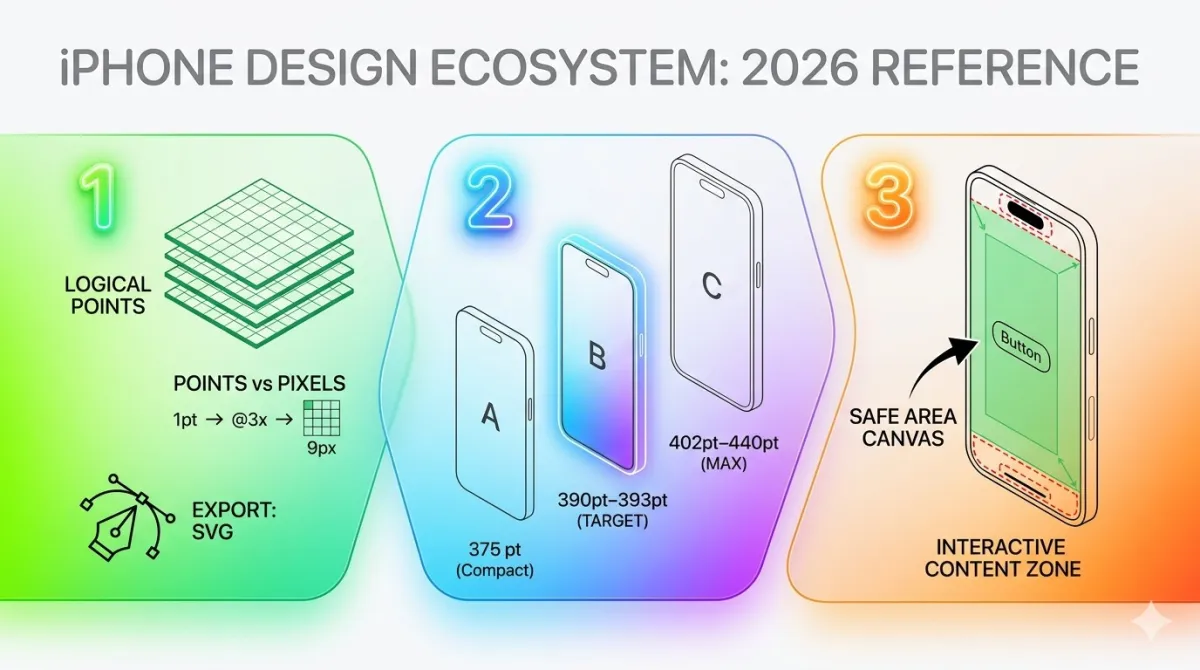
Points vs. Pixels — The Concept That Trips Everyone Up
This is the one that causes the most confusion, so let's take it slow.
Apple introduced the concept of points so that designers wouldn't have to think about pixels at all. A point is a logical unit that maps to a different number of physical pixels depending on the screen density of the device.
The idea: a button designed at 44pt should look the same physical size on every iPhone — even if the underlying pixel counts are completely different.
Here's how the scale system works:
| Scale | Pixel Ratio | Where You'll Find It |
|---|---|---|
| @1x | 1 point = 1 pixel | iPhone 3G, 3GS (ancient history) |
| @2x | 1 point = 4 pixels (2×2 grid) | iPhone 4 through SE 3rd gen |
| @3x | 1 point = 9 pixels (3×3 grid) | iPhone X onward — all modern iPhones |
@1x Grid (1 px)
@2x Grid (4 px)
@3x Grid (9 px)
The golden rule: always design in points. When you export assets, export at @1x, @2x, and @3x.
Designing in raw pixels without understanding this scale system is one of the most common beginner mistakes — and it shows on actual devices.
What Is PPI — And Why Does It Determine Sharpness?
PPI stands for pixels per inch. It tells you how many pixels are packed into one inch of the display. Higher PPI = smaller, denser pixels = sharper image.
The human eye can generally detect individual pixels when PPI drops below around 300 at a normal phone-viewing distance. Apple figured this out and called their solution Retina Display.
| Display Type | PPI |
|---|---|
| Standard Retina (LCD era) | 326 PPI |
| Pro Retina (OLED Pro models) | 460 PPI |
When Apple introduced Retina Display on the iPhone 4 in 2010, PPI doubled overnight from 163 to 326. Text and icons became visibly smoother — it was genuinely one of those "wow" moments in phone history.
PPI is calculated using both screen size and pixel resolution together. It's the intersection of both — you can't figure it out from just one of them.
What Is Resolution — And What Do HD, FHD, and 2K Actually Mean?
Resolution is the total pixel count: how many pixels wide × how many pixels tall. Those HD/FHD/2K labels are just shorthand names for common resolution ranges.
| Name | Resolution |
|---|---|
| HD | 1280 × 720 |
| Full HD (FHD) | 1920 × 1080 |
| 2K / QHD | 2560 × 1440 |
| 4K / UHD | 3840 × 2160 |
Modern iPhones land roughly in the FHD-to-2K range in raw pixel count. But their PPI blows TV and monitor numbers out of the water — because the screen is tiny and held about 12 inches from your face.
That's also why Apple doesn't market iPhones as "4K." At phone-viewing distances, PPI matters far more than raw pixel count.
Important: Screen size and resolution are completely independent measurements. A large screen can be low-resolution. A small screen can be extraordinarily sharp. Don't assume one tells you anything about the other.
The Master Reference: Every iPhone Screen Size & Resolution (2007–2026)
With the vocabulary locked in, here's the data you came for — organized so you can find exactly what you need at a glance, without wading through scattered Apple spec sheets.
The Evolution of iPhone Screen Sizes — A Brief Timeline
Apple didn't just suddenly decide to make big iPhones. Screen sizes grew gradually over nearly two decades, and each jump came with a genuine design shift.
| Era | Screen Sizes | What Changed |
|---|---|---|
| 2007–2013 | 3.5" and 4" | Compact, one-hand-friendly era |
| 2014–2016 | 4.7" and 5.5" | Apple entered the big-phone market with iPhone 6 |
| 2017–2020 | 5.8"–6.5" | OLED arrives, Face ID replaces Touch ID, screens grow taller |
| 2021–2026 | 5.4"–6.9" | Mini experiment, ProMotion, Dynamic Island, titanium builds |
From 2007 to 2026, iPhone screen size grew by roughly 97% diagonally. Nearly double. For designers, this means the "safe" base canvas has kept shifting larger every few years — what worked in 2015 needs serious revisiting today.
Complete iPhone Screen Size Table — All Models (2007–2026)
3.5" Group (2007–2011)
| Model | Year | Display Type |
|---|---|---|
| iPhone (1st gen) | 2007 | LCD |
| iPhone 3G | 2008 | LCD |
| iPhone 3GS | 2009 | LCD |
| iPhone 4 | 2010 | IPS LCD (Retina) |
| iPhone 4S | 2011 | IPS LCD (Retina) |
4.0" Group (2012–2016)
| Model | Year | Display Type |
|---|---|---|
| iPhone 5 | 2012 | IPS LCD (Retina) |
| iPhone 5s | 2013 | IPS LCD (Retina) |
| iPhone 5c | 2013 | IPS LCD (Retina) |
| iPhone SE (1st gen) | 2016 | IPS LCD (Retina) |
4.7" Group (2014–2022)
| Model | Year | Display Type |
|---|---|---|
| iPhone 6 | 2014 | IPS LCD |
| iPhone 6s | 2015 | IPS LCD |
| iPhone 7 | 2016 | IPS LCD |
| iPhone 8 | 2017 | IPS LCD |
| iPhone SE (2nd gen) | 2020 | IPS LCD (Retina) |
| iPhone SE (3rd gen) | 2022 | IPS LCD (Retina) |
5.4" Group — Mini Models
| Model | Year | Display Type |
|---|---|---|
| iPhone 12 Mini | 2020 | Super Retina XDR OLED |
| iPhone 13 Mini | 2021 | Super Retina XDR OLED |
5.5" Group (2014–2017)
| Model | Year | Display Type |
|---|---|---|
| iPhone 6 Plus | 2014 | IPS LCD |
| iPhone 6s Plus | 2015 | IPS LCD |
| iPhone 7 Plus | 2016 | IPS LCD |
| iPhone 8 Plus | 2017 | IPS LCD |
5.8"–5.85" Group — The iPhone X Era
| Model | Year | Display Type |
|---|---|---|
| iPhone X | 2017 | Super Retina OLED |
| iPhone XS | 2018 | Super Retina XDR OLED |
| iPhone 11 Pro | 2019 | Super Retina XDR OLED |
6.1" Group — The Biggest Active User Base
| Model | Year | Display Type |
|---|---|---|
| iPhone XR | 2018 | Liquid Retina LCD |
| iPhone 11 | 2019 | Liquid Retina LCD |
| iPhone 12 | 2020 | Super Retina XDR OLED |
| iPhone 13 | 2021 | Super Retina XDR OLED |
| iPhone 14 | 2022 | Super Retina XDR OLED |
| iPhone 15 | 2023 | Super Retina XDR OLED |
| iPhone 16 | 2024 | Super Retina XDR OLED |
Design callout: The 6.1" class has the widest global user base in 2026. If you're designing for just one screen size, this is the one.
6.3" Group
| Model | Year | Display Type |
|---|---|---|
| iPhone 16 Pro | 2024 | Super Retina XDR OLED (ProMotion) |
| iPhone 17 | 2025 | Super Retina XDR OLED (ProMotion) |
| iPhone 17 Pro | 2025 | Super Retina XDR OLED (ProMotion, AOD) |
6.5" Group
| Model | Year | Display Type |
|---|---|---|
| iPhone XS Max | 2018 | Super Retina XDR OLED |
| iPhone 11 Pro Max | 2019 | Super Retina XDR OLED |
| iPhone 17 Air | 2025 | Super Retina XDR OLED |
6.7" Group
| Model | Year | Display Type |
|---|---|---|
| iPhone 12 Pro Max | 2020 | Super Retina XDR OLED |
| iPhone 13 Pro Max | 2021 | Super Retina XDR OLED (ProMotion) |
| iPhone 14 Plus | 2022 | Super Retina XDR OLED |
| iPhone 14 Pro Max | 2022 | Super Retina XDR OLED (ProMotion, AOD) |
| iPhone 15 Plus | 2023 | Super Retina XDR OLED |
| iPhone 15 Pro Max | 2023 | Super Retina XDR OLED (ProMotion, AOD) |
| iPhone 16 Plus | 2024 | Super Retina XDR OLED |
6.9" Group — The Largest iPhone Displays Ever
| Model | Year | Display Type |
|---|---|---|
| iPhone 16 Pro Max | 2024 | Super Retina XDR OLED (ProMotion, AOD) |
| iPhone 17 Pro Max | 2025 | Super Retina XDR OLED (ProMotion, AOD) |
Complete iPhone Resolution & Pixel Density Table
This is the big one. Every iPhone, every resolution, all in one table.
Tip: For landscape orientation, swap the width and height values in the resolution columns.
Modern iPhones (iPhone 12 onward) — The Ones That Matter Most in 2026
| Model | Screen | Pixels (W×H) | Points (W×H) | Scale | PPI |
|---|---|---|---|---|---|
| iPhone 12 Mini / 13 Mini | 5.4" | 1080 × 2340 | 375 × 812 | @3x | 476 |
| iPhone 12 / 13 / 14 | 6.1" | 1170 × 2532 | 390 × 844 | @3x | 460 |
| iPhone SE 3rd gen | 4.7" | 750 × 1334 | 375 × 667 | @2x | 326 |
| iPhone 15 / 16 | 6.1" | 1179 × 2556 | 393 × 852 | @3x | 460 |
| iPhone 14 Plus / 15 Plus / 16 Plus | 6.7" | 1290 × 2796 | 430 × 932 | @3x | 460 |
| iPhone 14 Pro / 15 Pro | 6.1"–6.3" | 1179 × 2556 | 393 × 852 | @3x | 460 |
| iPhone 15 Pro Max | 6.7" | 1290 × 2796 | 430 × 932 | @3x | 460 |
| iPhone 16 Pro | 6.3" | 1206 × 2622 | 402 × 874 | @3x | 460 |
| iPhone 16 Pro Max | 6.9" | 1320 × 2868 | 440 × 956 | @3x | 460 |
| iPhone 17 | 6.3" | 1206 × 2622 | 402 × 874 | @3x | 460 |
| iPhone 17 Air | 6.5" | 1260 × 2736 | 420 × 912 | @3x | 460 |
| iPhone 17 Pro | 6.3" | 1206 × 2622 | 402 × 874 | @3x | 460 |
| iPhone 17 Pro Max | 6.9" | 1320 × 2868 | 440 × 956 | @3x | 460 |
Legacy iPhones (iPhone X Era)
| Model | Screen | Pixels (W×H) | Points (W×H) | Scale | PPI |
|---|---|---|---|---|---|
| iPhone X / XS / 11 Pro | 5.8" | 1125 × 2436 | 375 × 812 | @3x | 458 |
| iPhone XR / 11 | 6.1" | 828 × 1792 | 414 × 896 | @2x | 326 |
| iPhone XS Max / 11 Pro Max | 6.5" | 1242 × 2688 | 414 × 896 | @3x | 458 |
| iPhone 12 Pro Max | 6.7" | 1284 × 2778 | 428 × 926 | @3x | 458 |
| iPhone 13 Pro Max | 6.7" | 1284 × 2778 | 428 × 926 | @3x | 460 |
| iPhone 14 Pro Max | 6.7" | 1290 × 2796 | 430 × 932 | @3x | 460 |
Classic iPhones (Pre-OLED Era)
| Model | Screen | Pixels (W×H) | Points (W×H) | Scale | PPI |
|---|---|---|---|---|---|
| iPhone (1st gen) / 3G / 3GS | 3.5" | 320 × 480 | 320 × 480 | @1x | 163 |
| iPhone 4 / 4S | 3.5" | 640 × 960 | 320 × 480 | @2x | 326 |
| iPhone 5 / 5s / 5c / SE 1st gen | 4.0" | 640 × 1136 | 320 × 568 | @2x | 326 |
| iPhone 6 / 6s / 7 / 8 / SE 2nd gen | 4.7" | 750 × 1334 | 375 × 667 | @2x | 326 |
| iPhone 6 Plus / 6s Plus / 7 Plus / 8 Plus | 5.5" | 1080 × 1920 | 414 × 736 | @3x | 401 |
Models That Share the Same Logical Resolution (Design Once, Works Everywhere)
This is genuinely useful — because if two devices share the same point dimensions, a layout designed for one works on the other with zero changes.
| Logical Canvas | Models Covered |
|---|---|
| 390 × 844 pt | iPhone 12, 13, 14 (standard) — four generations, one layout |
| 393 × 852 pt | iPhone 15, 16, 15 Pro |
| 402 × 874 pt | iPhone 16 Pro, 17, 17 Pro |
| 430 × 932 pt | iPhone 14 Plus, 15 Plus, 15 Pro Max, 16 Plus |
| 440 × 956 pt | iPhone 16 Pro Max, 17 Pro Max |
| 375 × 812 pt | iPhone X, XS, 11 Pro, 12 Mini, 13 Mini |
| 375 × 667 pt | iPhone SE 2nd gen, SE 3rd gen |
iPhone 17 Series — Full Specifications (2025, Latest)
iPhone 17
- Screen: 6.3"
- Resolution: 1206 × 2622 px
- Logical canvas: 402 × 874 pt
- Scale: @3x
- Display: Super Retina XDR OLED, ProMotion (1–120Hz)
- Features the new camera bar design; same logical width as iPhone 16 Pro, so existing 16 Pro layouts need minimal rework
iPhone 17 Air
- Screen: 6.5" — Apple's thinnest iPhone ever built
- Resolution: 1260 × 2736 px
- Logical canvas: 420 × 912 pt
- Scale: @3x
- Display: Super Retina XDR OLED
- Same logical resolution family as XS Max and 11 Pro Max
iPhone 17 Pro
- Screen: 6.3"
- Resolution: 1206 × 2622 px
- Logical canvas: 402 × 874 pt
- Scale: @3x, 460 PPI
- Display: Super Retina XDR OLED, ProMotion, Always-On Display
iPhone 17 Pro Max
- Screen: 6.9"
- Resolution: 1320 × 2868 px
- Logical canvas: 440 × 956 pt
- Scale: @3x, 460 PPI
- Display: Super Retina XDR OLED, ProMotion, Always-On Display
- The largest and sharpest iPhone display ever built
- Sets the new mandatory App Store screenshot size baseline
iPhone 16 Series — Specifications
iPhone 16 & iPhone 16 Plus
| iPhone 16 | iPhone 16 Plus | |
|---|---|---|
| Screen | 6.1" | 6.7" |
| Resolution | 1179 × 2556 px | 1290 × 2796 px |
| Logical canvas | 393 × 852 pt | 430 × 932 pt |
| Scale | @3x | @3x |
| Key features | Action Button, Camera Control | Action Button, Camera Control |
iPhone 16 Pro & iPhone 16 Pro Max
| iPhone 16 Pro | iPhone 16 Pro Max | |
|---|---|---|
| Screen | 6.3" | 6.9" |
| Resolution | 1206 × 2622 px | 1320 × 2868 px |
| Logical canvas | 402 × 874 pt | 440 × 956 pt |
| Scale | @3x | @3x |
| Note | — | First iPhone with 6.9" screen |
iPhone 12–15 Series — Consolidated Reference
| Series | Model | Screen | Points (W×H) | Key Design Note |
|---|---|---|---|---|
| iPhone 12 | Standard | 6.1" | 390 × 844 pt | First OLED on standard model; @3x goes universal |
| iPhone 12 | Mini | 5.4" | 375 × 812 pt | Same logical width as X/XS — X-era designs transfer directly |
| iPhone 12 | Pro Max | 6.7" | 428 × 926 pt | Largest OLED at the time |
| iPhone 13 | Standard | 6.1" | 390 × 844 pt | Bigger battery, same logical canvas |
| iPhone 13 | Pro / Pro Max | 6.1" / 6.7" | 390 × 844 pt / 428 × 926 pt | ProMotion (120Hz) arrives on Pro |
| iPhone 14 | Standard | 6.1" | 390 × 844 pt | Same chip as 13 Pro; Dynamic Island on Pro only |
| iPhone 14 | Pro / Pro Max | 6.1" / 6.7" | 393 × 852 pt / 430 × 932 pt | Dynamic Island replaces notch on Pro; new logical canvas |
| iPhone 15 | Standard | 6.1" | 393 × 852 pt | Dynamic Island on all models; USB-C; titanium on Pro |
| iPhone 15 | Pro / Pro Max | 6.1" / 6.7" | 393 × 852 pt / 430 × 932 pt | Titanium frame, USB-C, A17 Pro chip |
Designer tip: iPhone 12 through 16 standard models all share a 390–393pt logical width. One base layout effectively serves five years of mainstream iPhone users.
iPhone SE, Mini, and Legacy Models — The Long Tail
iPhone SE — All Three Generations
| Model | Screen | Resolution | Logical Canvas | Scale |
|---|---|---|---|---|
| SE 1st gen | 4.0" | 640 × 1136 px | 320 × 568 pt | @2x |
| SE 2nd gen | 4.7" | 750 × 1334 px | 375 × 667 pt | @2x |
| SE 3rd gen | 4.7" | 750 × 1334 px | 375 × 667 pt | @2x |
The SE is still sold globally, especially in price-sensitive markets. It's easy to forget about — don't. The 375 × 667pt canvas is the narrowest you'll encounter on any currently sold iPhone, and it will expose layout issues that wider canvases happily hide.
iPhone Mini (12 Mini & 13 Mini)
- Screen: 5.4"
- Resolution: 1080 × 2340 px
- Logical canvas: 375 × 812 pt, @3x
- Same logical width as iPhone X, XS, and 11 Pro — existing X-era app designs transfer directly with no layout changes
Classic iPhones (iPhone 4–8)
These models are now an extremely small and rapidly declining share of the global install base. In 2026, you should only design for them if your own analytics specifically show you have active users on them. Otherwise, your time is genuinely better spent elsewhere.
Apple's Display Technologies: What's Behind the Glass
Pixel counts tell you how many dots exist. Apple's display technologies tell you what those dots actually do — and understanding them has real, practical implications for how you design.
Retina Display — The Watershed Moment
In 2010, Apple introduced Retina Display on the iPhone 4. The idea was simple but powerful: pack pixels so densely that the human eye can't distinguish individual ones at a typical viewing distance.
- Density: 326 PPI — double the 163 PPI of the iPhone 3GS
- What this meant for developers: @2x assets became mandatory overnight. Apps that weren't updated looked visibly blurry on iPhone 4. It was not a subtle difference.
- Today, every iPhone sold is Retina or better. There's no non-Retina iPhone in active mainstream use.
Super Retina XDR — OLED Comes to iPhone
Introduced with the iPhone X in 2017, Super Retina XDR brought OLED technology to the iPhone lineup.
OLED vs LCD — the key difference:
| Feature | LCD | OLED |
|---|---|---|
| How it works | Backlight shines through pixels | Each pixel emits its own light |
| True black | No (backlight leaks through) | Yes (pixel simply turns off) |
| Battery on dark content | Higher | Lower |
| Contrast ratio | Good | Exceptional |
The design implication? Pure black (#000000) backgrounds on OLED displays save battery and look dramatically richer than on LCD. Dark mode stopped being a novelty and became a genuine first-class design consideration from iPhone X onward.
ProMotion — Adaptive 120Hz Refresh Rate
Introduced on iPhone 13 Pro (2021), now standard on all Pro models (and on the iPhone 17 standard).
ProMotion adapts the display refresh rate from 1Hz (when the screen is showing something static) all the way to 120Hz (during fast scrolling and animations). The device handles this automatically.
Why does this matter for design?
- Animations at 120Hz feel dramatically smoother than at 60Hz
- A 60fps animation on a 120Hz ProMotion display can feel visibly sluggish — users notice this subconsciously, even if they can't articulate it
- The bar for motion quality is simply higher on Pro models
Always-On Display (AOD)
Available on iPhone 14 Pro and all Pro models since.
When the device is locked, AOD operates at 1Hz — showing the time, lock screen widgets, and Live Activities at extremely low power. It's a design surface that didn't exist before 2022.
If your app uses Live Activities (think: timers, delivery tracking, sports scores), AOD means your Live Activity can now be persistently visible even when the phone is locked and face-up on a desk. That's a design opportunity worth thinking about.
True Tone and P3 Wide Color
True Tone uses ambient light sensors to continuously adjust the display's white balance to match the lighting of the room. The screen just looks more natural in different environments.
P3 wide color gamut gives iPhone displays access to roughly 25% more colors than the standard sRGB color space used by most monitors and the web.
The practical implication: brand colors, product photography, and illustrations should be reviewed in Display P3 color space. Colors that look correct on a standard sRGB monitor may appear muted or slightly off on a P3-capable iPhone display. This is especially visible in saturated reds and greens.
Screen Anatomy: Safe Areas, Notches, Dynamic Island, and System Bars
Knowing the total screen dimensions tells you the size of the full canvas. What matters just as much is knowing which parts of that canvas are off-limits — reserved by hardware cutouts and iOS system elements you don't control.
From Notch to Dynamic Island — The Evolution of the Top Cutout
| Period | Design | Description |
|---|---|---|
| 2017–2022 | The Notch | Wide rectangular sensor housing at the top center of the screen |
| 2022–present | Dynamic Island | Pill-shaped interactive cutout that expands for system alerts |
The notch was a static dead zone — just a black shape sitting in your status bar area, and you worked around it. The Dynamic Island is actually functional: iOS uses it to animate ongoing system events like calls, timers, and Live Activities.
Both have the same design rule attached: never place critical interactive content in the top-center region of the screen.
What Is the Safe Area — And Why Is It Non-Negotiable?
The safe area is the region of the screen that is guaranteed to be free from hardware cutouts and OS interface elements. It's the part of the canvas you can actually use without worrying about something getting clipped or hidden.
Safe area insets vary depending on the device:
| Region | Face ID Devices (iPhone X onward) | Touch ID Devices (SE, older) |
|---|---|---|
| Top inset | 44–59 pt | 20 pt (status bar only) |
| Bottom inset | 34 pt (home indicator) | 0 pt |
The rule is simple: all interactive elements must live within the safe area. No exceptions.
Apps that place buttons outside the safe area — especially at the very bottom of the screen — trigger iOS's swipe-to-go-home gesture instead of the in-app action. Users hate this. It's a fast path to one-star reviews.
The Home Indicator — Bottom Navigation's New Neighbor
From iPhone X onward, the physical Home button was replaced by a software home indicator — a small horizontal bar at the bottom of the screen that users swipe up to go home.
- Reserves approximately 34 pt at the bottom of every Face ID device
- Primary CTAs, tab bars, and action buttons must all sit above this zone
- On Touch ID models (iPhone SE 2nd and 3rd gen), there's a physical Home button and no home indicator — layouts are different
Status Bar, Navigation Bar, and Tab Bar — Standard Heights
Here's a practical reality check: before a single pixel of your app content appears, iOS has already consumed a significant portion of vertical screen space.
| Element | Height (Older iPhones) | Height (Face ID / Dynamic Island) |
|---|---|---|
| Status bar | 20 pt | 44–54 pt |
| Navigation bar (standard) | 44 pt | 44 pt |
| Navigation bar (large title) | Up to 96 pt | Up to 96 pt |
| Tab bar | 49 pt | 83 pt (includes bottom padding) |
On a 6.1" iPhone with all system bars visible, you can lose anywhere from 127 to 183 pt of vertical space before your app content even starts.
Calculate your actual usable canvas like this:
Usable height = Total screen height − status bar − navigation bar − tab bar − home indicator
Aspect Ratios and Orientation
Dimensions and density are covered. Now let's talk about the shape of the screen — and what happens when users rotate their phones.
How iPhone Aspect Ratios Have Changed Over Time
| Era | Aspect Ratio | Notes |
|---|---|---|
| Original iPhone through iPhone 4S | 3:2 | Almost square by today's standards |
| iPhone 5 through 8 | 16:9 | Matched the widescreen video standard |
| iPhone X onward | ~19.5:9 | Taller and narrower; driven by edge-to-edge OLED and Face ID |
Classic (Pre-2012)
Widescreen era
Modern Flagships
If you design your app for a 16:9 aspect ratio on a 19.5:9 device, you're going to get unused letterboxed space at the top and bottom, or content will clip. Neither option looks intentional.
Portrait vs. Landscape — Design Implications
The vast majority of iPhone apps are portrait-first. Landscape is opt-in — you have to explicitly support it.
When a device rotates to landscape:
- Width and height values swap
- Safe area insets also shift: top and bottom insets shrink, while side insets grow to accommodate the sensor housing
Which app types genuinely need good landscape support:
- Video players
- Games
- Productivity tools (spreadsheets, document editors)
- Reading apps
For everything else: design portrait-first, then validate landscape. Most landscape layout problems exist because landscape was simply never tested.
Practical Design Framework: Applying This Knowledge
Data without application is just trivia. Here's how to turn everything above into concrete decisions during your actual design and development process.
The Recommended Base Canvas for 2026
| Setting | Value |
|---|---|
| Base canvas | 390 × 844 pt |
| Why | Covers iPhone 12 through 16 standard — five consecutive generations |
| Scale up to | 440 × 956 pt (iPhone 17 Pro Max) |
| Scale down to | 375 × 667 pt (iPhone SE 3rd gen) |
| How to handle scaling | Auto Layout (native) or Flexbox/Grid (web-based) — no separate redesign needed |
Never design in pixels. Always in points.
Setting Up Your Design File
Figma
- Set frame to 390 × 844 (iPhone 14/15/16 base canvas)
- Add safe area guide overlays: 44 pt top, 34 pt bottom for modern devices
- Apply an 8 pt grid system for consistent spacing
- Export settings: @1x, @2x, @3x for all raster image assets; PDF or SVG for icons and illustrations
Sketch
- Use the built-in iPhone artboard presets
- Enable responsive resizing on symbol components
- Group components using safe-area-aware constraints
Adobe XD
- Set artboard to the iPhone 14 preset
- Use Responsive Resize for component scaling
- Use repeat grids for list-based UI testing across different canvas sizes
Image and Asset Guidelines
| Asset | Specification |
|---|---|
| App Icon | Submit 1024 × 1024 px; Xcode auto-generates all required sizes |
| Launch Screen | Design for largest canvas (1320 × 2868 px / 440 × 956 pt) — scales down gracefully |
| In-app raster images | Provide @1x, @2x, @3x variants for every image asset |
| Icons and illustrations | Use vector formats (SF Symbols, PDF, SVG) — render perfectly at any resolution |
Warning: Providing only @1x assets on a @3x device causes visibly blurry images. This is probably the most common and most avoidable quality issue in iPhone apps — and users absolutely notice it.
App Store Screenshot Specifications (2026)
| Status | Size | Device |
|---|---|---|
| Mandatory | 6.9" | iPhone 17 Pro Max / 16 Pro Max |
| Mandatory | 5.5" | iPhone 8 Plus |
| Recommended | 6.5" | iPhone 17 Air / XS Max |
- Portrait and landscape variants are both allowed (up to 10 screenshots per localization)
- App Preview videos: 15–30 seconds, up to 3 per localization
- If you skip non-mandatory sizes, the App Store auto-scales from your mandatory submissions — test those scaled versions before publishing. They often look a bit wrong.
Touch Target Size — The 44 × 44 pt Minimum
Apple's Human Interface Guidelines are clear on this: every interactive element needs a minimum tappable area of 44 × 44 points.
Why? Smaller targets cause mis-taps. This gets worse on smaller screens like the SE, and it gets worse for users with motor impairments.
A button can look smaller — a 20pt icon is fine visually — but its invisible tappable hit area needs to be padded out to 44 × 44pt.
To check: use Xcode's Accessibility Inspector to visualize touch targets across different device sizes.
Typography and Dynamic Type
| Setting | Value |
|---|---|
| Minimum readable body text | 11 pt |
| Recommended body text | 15–17 pt |
| Dynamic Type maximum scale | Up to 310% via Accessibility settings |
A meaningful number of iPhone users increase their system font size — either because they prefer it or because they need it. Your app must handle this gracefully.
Rules:
- All text containers must be dynamic-height — never fixed height
- Use Apple's semantic text styles (Body, Headline, Caption) instead of hard-coded font sizes; they automatically respond to Dynamic Type settings
- Test across at least three Dynamic Type sizes: default, large, and the largest accessibility size
Display Zoom Mode — The Overlooked Wild Card
Display Zoom is an Accessibility setting that renders the entire UI at a larger scale, which effectively reduces the logical canvas size your app has to work with.
A meaningful share of users — particularly older iPhone owners — run Display Zoom permanently. They've turned it on once and never thought about it again.
Add Display Zoom to your QA checklist alongside regular portrait and landscape testing. You'll be surprised what it breaks.
Common Mistakes and Pitfalls
Even experienced designers fall into these traps. Knowing them in advance saves hours of debugging and prevents App Store rejections.
Mistake 1: Designing in Pixels Instead of Points
Symptom: Layout looks correct in your design software but something's visually off on the actual device.
Fix: Work entirely in points. Only think in pixels when you're specifying export resolutions for assets.
Mistake 2: Providing Only One Asset Scale
Symptom: Images look blurry on Pro models (@3x), or they're oversized and heavy on SE (@2x).
Fix: Always export @1x, @2x, and @3x. Even better: use vector assets wherever possible and avoid the problem entirely.
Mistake 3: Ignoring Safe Areas
Symptom: Buttons are hidden behind the Dynamic Island. Content is clipped by the home indicator swipe zone.
Fix: Implement safe area insets in every single screen layout, without exception. This is non-negotiable.
Mistake 4: Hardcoding Dimensions
Symptom: App looks correct on one device size and broken on every other.
Fix: Use flexible layout systems — Auto Layout in native apps, Flexbox or CSS Grid in web-based apps. Size things proportionally, not absolutely.
Mistake 5: Only Testing on One Screen Size
This is the most common shortcut and the most dangerous one.
Fix: Always test on the smallest logical canvas (SE: 375 × 667 pt) and the largest (17 Pro Max: 440 × 956 pt) in your target range. Problems that are invisible at 390pt often appear immediately at both extremes.
Mistake 6: Ignoring Dynamic Type
Symptom: Text overflows its container or gets clipped when the user has increased their system font size in Accessibility settings.
Fix: All text containers must be dynamic-height. Test at default, large, and maximum Dynamic Type sizes before shipping.
Mistake 7: Submitting Wrong App Store Screenshot Sizes
Submitting screenshots at discontinued sizes, or missing the new 6.9" mandatory requirement, will get your submission rejected or scaled incorrectly. The first impression in the App Store looks unprofessional.
Fix: Update your screenshot set every time Apple introduces a new mandatory baseline. Check the current requirements in App Store Connect before every major release.
Mistake 8: Placing UI Elements at the Exact Screen Edge
Symptom: Interactive elements at the very bottom of the screen trigger the iOS swipe-to-go-home gesture instead of the intended in-app action.
Fix: Apply the bottom safe area inset (34 pt on all Face ID devices) as a minimum bottom padding for every bottom-anchored UI element.
Expert Tips & Best Practices
Beyond avoiding mistakes — here's what separates merely functional iPhone apps from genuinely polished ones.
Adopt a Resolution-Agnostic Mindset
Stop thinking "I'm designing for iPhone 17 Pro Max." Start thinking in logical points and let iOS handle the scaling.
The goal is a layout that feels intentional and balanced on a 375 pt canvas AND a 440 pt canvas — two very different physical sizes, one design system.
Use Apple's Human Interface Guidelines as Your Primary Reference
The Apple Human Interface Guidelines are free, authoritative, and updated with every iOS release. They cover spacing, component sizes, typography, color, motion, and accessibility — all in one place.
Treat the HIG as the final word on any design decision. Before any blog post, tutorial, or Stack Overflow answer — including this guide — check the HIG.
Design Dark Mode From the Start — Not as an Afterthought
OLED displays (every iPhone from X onward) render true black at 0 nits. Dark mode on OLED looks genuinely dramatic compared to LCD — and it saves meaningful battery life on deep black content.
Use Apple's semantic color system (system background, label, secondary label) which automatically adapts between light and dark mode. Building dark mode in from day one takes almost no extra time. Retrofitting it after an app is built is painful.
Build a Device Testing Matrix and Stick to It
Minimum recommended physical devices for 2026:
- iPhone SE 3rd gen (smallest logical canvas, @2x, Touch ID, Home button)
- iPhone 15 or 16 standard (mainstream canvas)
- iPhone 16 or 17 Pro Max (largest canvas, Dynamic Island, ProMotion)
Supplement with Xcode Simulator for all other sizes.
Every QA cycle must include:
- Display Zoom ON
- Dynamic Type set to the largest accessibility size
- Landscape orientation
- Dark mode
Use SF Symbols for All Iconography
Apple's SF Symbols library contains 5,000+ icons that are vector-based and resolution-independent. They automatically adapt to Dynamic Type size, Bold Text accessibility settings, and light/dark mode.
Using SF Symbols means you never have to export icon assets at multiple scales. They just work — at any size, any density, any mode.
Prioritize the First Viewport
Whatever content appears on screen at app launch — before any scrolling happens — is your app's entire first impression. Most users make their "keep or delete" decision in the first few seconds.
Design the top 600–700 pt of every key screen with the same level of care you'd give a landing page hero section. That space is prime real estate.
Section 9 — Frequently Asked Questions
Before wrapping up, here are the questions real users search for most — answered directly.
What is the best iPhone resolution to design for in 2026?
Design in points, not pixels. Use 390 × 844 pt as your base canvas — it covers iPhone 12 through 16 standard models (five generations). Make sure your layout flexes up to 440 × 956 pt (iPhone 17 Pro Max) and down to 375 × 667 pt (SE 3rd gen) through flexible layout constraints.
What's the difference between screen size and screen resolution?
- Screen size = the physical diagonal measurement in inches (how big the display is)
- Screen resolution = the pixel count (how sharp and detailed the display is)
A smaller phone can have a higher resolution than a larger one. Size and resolution are completely independent of each other.
Do I need to create a separate design for every iPhone model?
No. Use Auto Layout (for native apps) or responsive CSS (for web-based apps), and design in points. Models sharing the same logical resolution — like the 390 × 844 pt group that covers four consecutive iPhone generations — need zero layout changes between them.
You only need genuinely separate layouts when the content strategy changes significantly between small and large screens.
What is the Dynamic Island and how does it affect app layouts?
The Dynamic Island is a pill-shaped hardware cutout on iPhone 14 Pro and all models from iPhone 15 onward. It houses Face ID sensors and the front camera, and iOS animates it for calls, timers, Live Activities, and other system alerts.
Design rule: never place critical interactive content in the top-center ~37 × 126 pt zone of the screen. Use safe area insets, and iOS handles the rest automatically.
What App Store screenshot sizes are required in 2026?
Mandatory:
- 6.9" (iPhone 17 Pro Max / 16 Pro Max)
- 5.5" (iPhone 8 Plus)
Recommended:
- 6.5" (iPhone 17 Air / XS Max)
The App Store auto-scales missing sizes from mandatory submissions — always check how the scaled versions actually look before publishing.
Why do images look blurry on newer iPhone Pro models?
Pro models use @3x scale — one point renders as 9 physical pixels (a 3×3 grid). If you supply a @1x or @2x image, it gets upscaled to fill that grid. The result is visible blur.
Fix: always provide @1x, @2x, and @3x variants for every raster image asset. Better yet: use vector assets that render crisply at any scale without needing multiple exports.
Does screen resolution affect app performance?
Yes. Higher-resolution screens require more GPU work per frame. Modern iPhones handle this well under normal conditions, but poorly optimized animations, excessive layer compositing, and uncompressed large images can cause dropped frames even on flagship hardware.
Always performance-test on the oldest device in your support range — not just the latest model.
What is Display Zoom and do I need to design for it?
Display Zoom is an Accessibility setting that magnifies the interface, effectively reducing the logical canvas size available to your app. A meaningful share of users — particularly older iPhone owners — run Display Zoom permanently.
Include Display Zoom in your QA checklist. Run at least one full QA pass per release cycle with Display Zoom enabled.
What is the logical resolution of the iPhone SE and why does it matter?
iPhone SE 2nd and 3rd gen: 375 × 667 pt — the narrowest logical canvas on any currently sold iPhone.
Designs that look spacious on a 390 pt or 440 pt canvas can feel cramped or overflow on 375 pt. Always validate layouts at 375 × 667 pt before shipping — SE users will find layout problems that wide-screen testing completely misses.
What's the difference between @2x and @3x, and which is more common in 2026?
| Scale | Pixel Grid | Where It's Found |
|---|---|---|
| @2x | 1 pt = 4 pixels (2×2) | iPhone 4 through SE 3rd gen |
| @3x | 1 pt = 9 pixels (3×3) | iPhone X through 17 — all modern flagships |
In 2026, @3x is the dominant standard. The only @2x device still actively sold is the iPhone SE. Design primarily for @3x, and ensure @2x assets are included for SE support.
Conclusion — Key Takeaways
You've covered the entire landscape — from what a pixel actually is to the latest iPhone 17 Pro Max specs and everything a designer or developer needs to build confidently for all of them.
Here's what to take with you:
- Screen size (inches) = physical canvas. Resolution (pixels) = detail and sharpness. PPI = the intersection of both.
- Always design in logical points, not pixels. Export assets at @1x, @2x, and @3x.
- The safe area is non-negotiable. Respect it on every screen, on every device.
- The Dynamic Island (iPhone 14 Pro onward) and home indicator (iPhone X onward) permanently shape layout decisions.
- Your canonical design base for 2026 is 390 × 844 pt, flexing to 440 × 956 pt (17 Pro Max) and 375 × 667 pt (SE).
- Always test on the smallest and largest canvases in your support range — including Display Zoom and Dynamic Type accessibility settings.
- ProMotion, Always-On Display, OLED, and P3 wide color aren't just marketing buzzwords. Each one carries a concrete design implication.
Ready to Turn This Knowledge Into a Real iPhone App?
You now understand iPhone screen specifications better than most developers and designers who've been in the field for years. The logical next step is putting that knowledge to work.
If you have a website and want to launch it as a polished, App Store-ready iPhone app — without hiring a development team or learning Swift — AppOfWeb makes it happen (read our full guide on how to convert your website to an iPhone app here). You share your website URL, their team handles everything: development, design optimization for all screen sizes, App Store publishing, and ongoing support. There's even a free demo build available so you can see your app in action before committing.
Your knowledge of iPhone screens is complete. Now go build something worth looking at.