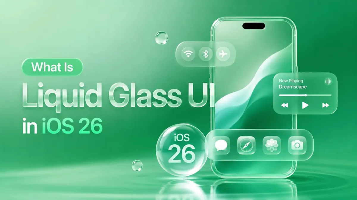
What Is Liquid Glass UI in iOS 26? Everything Developers Need to Know
iOS 26 just landed the biggest redesign since iOS 7 flattened everything back in 2013. If you've watched the WWDC 2025 keynote, you already know the name: Liquid Glass. If you haven't, buckle up — because this isn't just a fresh coat of paint.
This guide covers everything you need: what Liquid Glass actually is, why Apple built it, how it affects system components, and exactly how to adopt it in SwiftUI and UIKit. Whether you're an indie dev working on your first app or an engineering lead steering a large team, there's something here for you.
Table of Contents
- What Is Liquid Glass UI?
- Why Apple Introduced Liquid Glass
- Core Visual Principles of Liquid Glass
- How Liquid Glass Affects System UI Components
- Adopting Liquid Glass in SwiftUI
- Adopting Liquid Glass in UIKit
- Customization, Theming & Overrides
- Accessibility Considerations
- Performance Implications
- Testing & Debugging
- Migration Guide: iOS 17/18 → iOS 26
- Common Mistakes & How to Avoid Them
- FAQs
- Conclusion & Next Steps
1. What Is Liquid Glass UI?
Liquid Glass UI Explained in Plain English
Let's skip the marketing language and get straight to it.
The One-Sentence Definition
Liquid Glass is Apple's new adaptive, translucent material design system in iOS 26. It gives UI elements a dynamic, glass-like appearance that responds to the content sitting behind them — in real time.
A Quick Visual Analogy
Imagine holding a piece of frosted glass over a colourful painting. The glass blurs the image slightly, picks up hints of the colours underneath, and reflects a tiny bit of light on its surface. Now imagine that glass is alive — it adjusts as you move the painting, brightens when it catches light, and subtly bends what's behind it.
That's Liquid Glass.
It's different from the older frosted-glass blur Apple introduced in iOS 7. That was more like a static smudge effect — one look, one intensity, always the same. Liquid Glass is a full material system with four distinct properties (more on those in a moment).
The "liquid" part of the name isn't just branding fluff. The material feels fluid rather than rigid. Elements can merge like water droplets when they overlap, and they materialise on screen by gradually bending light rather than just fading in.
Where Did It Come From?
Liquid Glass has a clear design lineage: it evolved directly from Apple's work on visionOS and the Apple Vision Pro. In spatial computing, you can't use solid, opaque UI panels — they'd block the real world. So Apple spent years solving how to build interface elements that feel physically present in 3D space, stay readable on any background, and create visual hierarchy through depth instead of contrast.
The solution they landed on for Vision Pro was glass. Then someone at Apple had the obvious follow-up idea: bring it to every device they make.
Apple announced Liquid Glass at WWDC 2025 on June 9th. The key sessions to watch are "Meet Liquid Glass" and "Design with the Liquid Glass design system" — both are available on developer.apple.com.
What Platforms Support Liquid Glass?
| Platform | Support Level |
|---|---|
| iOS 26 | Full support |
| iPadOS 26 | Full support |
| macOS Tahoe (26) | Full support |
| watchOS 12 | Limited support |
| tvOS 26 | Limited support |
If you're deploying to older OS versions, you'll need to write fallback code — the glass APIs simply don't exist pre-iOS 26.
2. Why Apple Introduced Liquid Glass
The "Why" Behind the Design Shift
Understanding why Apple made this move helps you approach it as a collaborator rather than someone just grudgingly checking boxes. Here's the thinking.
Converging Apple Platforms
For years, iOS felt visually different from visionOS — flat and 2D versus deep and spatial. That dissonance becomes a real problem as users move between iPhone, iPad, Mac, and Vision Pro in the same day. Liquid Glass gives Apple a shared visual vocabulary across all its platforms. One design language, every device.
Depth, Hierarchy & Spatial Awareness
Flat design solved one problem (cluttered icons, gratuitous textures) but created another: everything looked equally flat. When everything is on the same visual plane, you have to work harder to show which elements are foreground and which are background.
Liquid Glass brings back depth — but it does it without going back to the fake leather and wood grain of skeuomorphism. The hierarchy comes from translucency, light refraction, and elevation, not from silly textures.
The Role of Display Technology
This kind of effect simply wasn't viable ten years ago. Modern OLED displays, ProMotion refresh rates, and Apple's own silicon (with dedicated GPU performance) make real-time glass compositing fast enough to run at 120fps without sweating.
Hardware caught up with the design idea. Now Apple is using it.
Responding to Design Trends — On Apple's Terms
Glassmorphism has been circling the design world for a few years — you've probably seen it in web UI and some Android apps. Apple's implementation is more rigorous: the glass is physically modelled, not just a semi-transparent layer slapped on top. It refracts, tints, and responds to context. The rest of the industry does a vibe; Apple built a system.
3. Core Visual Principles of Liquid Glass
Understanding the Visual Language Before Writing a Single Line of Code
Before you touch any API, it's worth understanding what Liquid Glass actually does visually. There are four properties at play.
The Four Properties of Liquid Glass Materials
1. Translucency
How much of the background content shows through the glass layer. This isn't a fixed value — the system adjusts it based on context.
2. Refraction (Lensing)
Liquid Glass doesn't just blur — it bends and concentrates light in real time. Think of how a glass of water distorts a straw. iOS 7 scattered light; Liquid Glass bends it.
3. Specular Highlights
The tiny light reflections on the surface of the glass. These respond to device motion — tilt your phone and the highlight shifts, making it feel tangible.
4. Adaptive Tinting
The glass samples the dominant colour behind it and picks up that tint. A floating panel over a red background gets a warm blush. The system handles this automatically.
Light vs. Dark Mode Behaviour
The glass behaves noticeably differently in light and dark environments. In Dark Mode, specular highlights become more intense because they stand out against the darker canvas. The opacity and tint values both shift automatically.
The developer implication here is important: never hardcode material colours. If you set UIColor.white on a glass surface, you'll get contrast failures and a brittle design. Use semantic colours and vibrancy APIs instead.
Dynamic Background Sampling
iOS 26 samples pixel data from the content beneath a glass layer in real time — this is called "live blur" as opposed to the old static blur. The upside is that the material always looks contextually appropriate. The downside is that the rendering order matters. Glass layers need to know what's underneath them before they composite, which has performance implications (covered later).
Layering & Z-Depth
iOS 26 thinks about the screen in three conceptual layers:
- Content — your actual app content (photos, text, lists)
- Overlay — sheets, popovers, menus sitting above content
- Chrome — navigation bars, tab bars, toolbars
Liquid Glass creates implied elevation between these layers without using drop shadows. Think of it like a stack of transparent acetate sheets lit from above: each layer is distinct even though you can see through them all.
When stacking multiple Liquid Glass elements, follow the hierarchy above. Don't stack chrome on top of chrome — it creates visual noise and a measurable performance hit.
4. How Liquid Glass Affects System UI Components
What Changed Out of the Box — No Code Required
Good news first: Apple has already done a lot of the work for you. Recompile your app with the iOS 26 SDK and many system components update automatically.
Navigation Bars
The navigation bar now has a "dormant" state (when the user is at the top of a scroll view) and an "active" state (when they've scrolled down and content is passing underneath). In the active state, the glass intensifies — you can see content moving through the bar. On iPad, the behaviour is slightly different and more pronounced because of the larger canvas.
Tab Bars
The tab bar has gone from a flat bottom strip to a floating, pill-shaped glass element that hovers above your content. This is the change most users will notice immediately. Icon and label treatment has been updated to work on translucent surfaces.
Note that the home indicator interaction area has changed with this layout — test your bottom-edge gestures carefully.
Toolbars & Bottom Sheets
Toolbars now inherit the Liquid Glass material by default. Bottom sheets (half-sheets and full sheets) get a glass treatment as well, including the drag handle and dismiss animation. Sheets don't just slide up — they materialise.
Alerts, Menus & Popovers
Glass-style modal surfaces replace the old flat-white alert boxes. Context menus have been updated with a glass background and blurred content behind them. The visual improvement here is genuinely nice — modals no longer feel like they're hovering on top of a paper cutout.
Sidebars & Split Views (iPad & Mac)
On iPad and macOS Tahoe, sidebars pick up the Liquid Glass material and float above the main content. The system expects vibrant content underneath the sidebar so the glass has something interesting to react to. Apple's own TV app is a good reference here — artwork extends behind the sidebar for exactly this reason.
For inspector panels on Mac, similar rules apply.
Status Bar & Dynamic Island
The status bar background behaviour has changed — it now integrates more seamlessly with navigation bar glass rather than sitting as a separate block of colour. The Dynamic Island has received updated glass integration that makes pill-based Live Activities feel more cohesive.
5. Adopting Liquid Glass in SwiftUI
SwiftUI + Liquid Glass: The Developer's Playbook
SwiftUI adoption ranges from "it just works" to "you'll need to rewrite this entire component." Here's how to know which bucket you're in.
What You Get for Free
If you recompile your app against the iOS 26 SDK without changing any code, SwiftUI's system components — NavigationStack, TabView, sheets, alerts — will automatically adopt the new glass appearance. This is called "automatic adoption."
There's a catch, though. Apps that haven't been recompiled for iOS 26 run in a compatibility mode that approximates the old appearance. It won't look broken, but it won't look current either. The "inert glass" experience is what users will see until you ship an update.
The message: recompile early and test. Don't wait for the public OS release to discover what broke.
New Material Types in SwiftUI
SwiftUI's .material modifier hierarchy has been expanded. The available variants, roughly from most transparent to most opaque, are:
.ultraThinMaterial.thinMaterial.regularMaterial.thickMaterial.ultraThickMaterial.glass(new in iOS 26)
Use .glass when you want the full Liquid Glass treatment — lensing, specular highlights, adaptive tinting. The other material variants still work and are appropriate for backgrounds that don't need the full effect (like a simple frosted backdrop on a settings panel).
To apply a material to a custom view:
MyCustomView()
    .background(.glass)
    .clipShape(RoundedRectangle(cornerRadius: 16, style: .continuous))
Glass Containers
iOS 26 introduces a new glass container API that wraps custom content in a properly-spec'd glass surface. Best practices:
- Use consistent padding (16pt is a safe default)
- Use continuous corner radii (
.continuousinRoundedRectangle) - Do not nest glass containers inside glass containers — this creates visual and performance problems
Background & Overlay Modifiers
The .background() and .overlay() modifiers have updated behaviour in iOS 26. Applying .background(.glass) to a VStack or ZStack works as expected, but watch for "double blur" artifacts when you have nested backgrounds that both apply blur.
If you're seeing a muddy or over-blurred appearance, audit your view hierarchy for stacked background modifiers.
Adapting Custom Navigation & Tab Views
If you've built a custom NavigationStack replacement or a bespoke tab bar, this is where you have real work to do. The system's new glass tab style has a specific shape, blur intensity, and floating behaviour — matching it exactly with a custom component is non-trivial.
The honest advice: wherever possible, move back to system components. The glass treatment is deep in the rendering layer; trying to replicate it perfectly in user space is an ongoing maintenance burden.
If you must keep a custom implementation, the .toolbar modifier with Liquid Glass toolbar items is your starting point. Compare visually against the system tab bar on a real device.
Colour & Vibrancy in SwiftUI
On glass surfaces, use the vibrancy-appropriate label colours:
.primary— for main text and important icons.secondary— for supporting text.tertiary— for placeholder and decorative elements
Opaque colours (e.g. Color.black, Color.white) on glass surfaces create legibility failures. On a dark wallpaper with white glass, Color.white text becomes invisible. Use semantic colours — the system handles the rest.
Animations & Transitions
iOS 26 introduces glass-aware transitions. When a glass element appears, it materialises by gradually increasing light bending rather than simply fading in opacity. To use the system's default materialisation animation:
MyGlassView()
    .transition(.opacity.combined(with: .scale(scale: 0.95)))
    .animation(.spring(response: 0.4, dampingFraction: 0.8), value: isVisible)
For animating material intensity changes (e.g. transitioning from .thinMaterial to .glass), keep animations short (under 300ms) and use spring curves to match the system feel.
6. Adopting Liquid Glass in UIKit
UIKit + Liquid Glass: What Changed and What You Need to Update
If your app is UIKit-first, don't worry — Apple has provided solid APIs here too.
Automatic Adoption via UIKit System Bars
Recompile with Xcode 26 and the following update automatically:
UINavigationBarUITabBarUIToolbar
The UIBarAppearance APIs still work, but some older configuration patterns are deprecated in iOS 26. Check the release notes for the specific deprecations — they mostly involve manually setting bar background colours or custom translucency configurations that the new glass system handles differently.
The New UIGlassEffect API
UIGlassEffect is the UIKit equivalent of SwiftUI's .glass material. You apply it via UIVisualEffectView:
let glassEffect = UIGlassEffect()
glassEffect.cornerRadius = 16
glassEffect.tintColor = .systemBlue.withAlphaComponent(0.1) // optional brand tint

let effectView = UIVisualEffectView(effect: glassEffect)
effectView.frame = myView.bounds
myView.addSubview(effectView)
You can configure the corner radius, intensity, and an optional tint colour. Stick to low-opacity tints (under 15%) to keep contrast ratios healthy.
There's also UIGlassContainerEffect — use this when you have multiple glass elements that should share a unified background, ensuring consistent adaptation across different content behind them.
Visual Effect Views in iOS 26
UIVisualEffectView has been updated with new blur styles that work alongside Liquid Glass. The older blur styles (UIBlurEffectStyle.systemMaterial, etc.) still work for backward-compatible code paths.
For apps that need to support iOS 17 or 18 alongside iOS 26, a conditional pattern:
if #available(iOS 26, *) {
    effectView.effect = UIGlassEffect()
} else {
    effectView.effect = UIBlurEffect(style: .systemMaterial)
}
Custom UIKit Components with Glass Backgrounds
To add a Liquid Glass background to any custom UIView:
- Create a
UIVisualEffectViewwithUIGlassEffect - Add it as the bottom-most subview of your container
- Constrain it to the edges of the container
- Clip the container to your desired shape
Handle trait collection changes in traitCollectionDidChange(_:) — you'll want to respond to changes in UITraitUserInterfaceStyle (light/dark), UITraitAccessibilityContrast (Increase Contrast), and UITraitLegibilityWeight.
For UIViewPropertyAnimator with glass-aware properties, the system handles most of the heavy lifting. Animate your container's alpha, transform, or frame normally; the glass effect updates automatically.
UIKit + SwiftUI Interop on iOS 26
If you're mixing UIKit and SwiftUI (which most teams are at this point), glass materials cross the bridge cleanly. SwiftUI glass modifiers applied inside a UIHostingController render correctly. UIViewRepresentable wrappers for UIKit glass views work in SwiftUI hierarchies.
The main interop pitfall to watch: don't apply glass at both the SwiftUI and UIKit level on the same element. You'll get double-blur artifacts. Pick one layer to own the glass effect per view.
7. Customization, Theming & Overrides
Making Liquid Glass Yours — Without Breaking Apple's Guidelines
Tinting Glass Surfaces
You can apply a brand colour tint to a glass surface. The key is keeping the opacity low — Apple's own guidance suggests staying under 15% opacity for a tint on a glass material. Above that, you start losing the transparency and contrast compliance becomes harder.
In UIKit, set glassEffect.tintColor = UIColor.systemBlue.withAlphaComponent(0.1). In SwiftUI, combine .glass with a low-opacity .overlay() of your brand colour.
When you tint glass, the specular highlights shift to accommodate the tint — you won't need to adjust them manually.
Disabling or Reducing Liquid Glass
Some apps don't need glass everywhere. Games, video players, and immersive experiences may want to suppress it entirely for specific views.
For UIKit, apply an opaque background to your view — the glass effect only activates when the system can see through the surface. For SwiftUI, .background(.regularMaterial) or a flat opaque colour prevents the full glass treatment.
The opt-out APIs exist — use them deliberately rather than fighting the system.
Custom Corner Radii & Shapes
iOS 26 uses continuous (squircle-style) corner radii throughout. If you're applying glass to a non-rectangular shape, use clipShape in SwiftUI or CALayer.masksToBounds with a CAShapeLayer in UIKit.
One caveat: clipping and masking interact with the refraction layer in ways that can look unexpected at sharp edges. Test custom shapes on a real device with varied wallpapers.
App Icons & Launch Screens
iOS 26 introduces an adaptive icon treatment — icons now support multiple layers, creating depth. Xcode 26's asset catalog has been updated with new slots for this. Your launch screen background should be set to complement the glass material of your app's first screen, creating a seamless transition from launch to loaded.
8. Accessibility Considerations
Liquid Glass and Accessibility — Non-Negotiable Requirements
This section isn't optional reading. Accessibility compliance isn't just the right thing to do — in many markets, it's a legal requirement.
Reduce Transparency Support
When a user enables Settings → Accessibility → Reduce Transparency, the system replaces glass materials with opaque fallbacks. Apple's own system components handle this automatically.
For your custom glass views, you must implement fallbacks too. In SwiftUI:
@Environment(\.accessibilityReduceTransparency) var reduceTransparency

var body: some View {
    MyView()
        .background(reduceTransparency ? Color(.systemBackground) : .glass)
}
In UIKit, listen for UIAccessibility.reduceTransparencyStatusDidChangeNotification and swap your effect view accordingly.
Contrast and Legibility on Glass Surfaces
This is where glass gets genuinely tricky. Glass surfaces sit on top of dynamic backgrounds, so the effective contrast ratio of your text changes depending on what's showing through. You can't check contrast ratio against a fixed colour.
The practical approach:
- Use vibrancy-appropriate semantic colours for all text and icons on glass surfaces
- Test on multiple wallpapers — a bright white wallpaper and a dark colourful one are your stress tests
- Enable Increase Contrast in accessibility settings and verify legibility
- WCAG AA requires 4.5:1 contrast for normal text; target this as a minimum
Reduce Motion and Glass Animations
Glass materialisation and merge animations are beautiful, but they're still animations. If a user has Reduce Motion enabled, these should be simplified or removed.
In SwiftUI, animations that are wrapped in withAnimation respect the system's reduce motion preference when you use .default animation curves. For more control:
@Environment(\.accessibilityReduceMotion) var reduceMotionIn UIKit, check UIAccessibility.isReduceMotionEnabled and provide a simpler transition (e.g. a crossfade) in place of the glass materialisation.
VoiceOver and Semantic Layering
Glass creates implied visual layers — but VoiceOver doesn't understand visual layering, only semantic structure. Make sure your accessibilityElement(children:) settings correctly reflect what's logically foreground and what's background.
Test VoiceOver traversal on any screen with stacked glass elements. The order VoiceOver reads content should match the order a sighted user would process it.
9. Performance Implications
Glass Is Beautiful. Is It Fast?
How the Rendering Pipeline Works
iOS uses Metal and Core Animation to composite Liquid Glass layers. Here's the simplified version:
- The system renders the content below the glass element
- That rendered output is sampled, refracted, tinted, and composited with the specular highlight layer
- The result is placed on screen
[ Content Render Output ]
         |
         v
[ Refraction Engine ] --> (Bends Light & Lensing)
         |
         v
[ Adaptive Tint & Specular ]
         |
         v
[ Final Screen Composite ]
This is more GPU-intensive than drawing an opaque rectangle. The gap is real but manageable on modern Apple silicon. On supported iOS 26 devices (generally A14 and later), the headroom is sufficient. The exception: pile up many glass layers and you'll feel it.
Whether the blur is recalculated every frame or cached depends on whether the background content is moving. Static backgrounds get cached; scrolling content forces recalculation.
Target FPS
120System Risk
SafeCommon Performance Pitfalls
- Stacking too many glass layers — each layer has a "blur budget." Exceeding it causes frame drops.
- Glass inside fast-scrolling lists — if you put a glass background on a
Listrow orUICollectionViewcell, every scroll frame has to redraw the blur for every visible cell. This is almost always a mistake. - Animating glass opacity at high frequency — keep glass opacity animations under 60fps update frequency; higher rates rarely look better and cost proportionally more.
Profiling Glass Performance
Use Instruments to check:
- Metal System Trace — GPU utilisation and GPU frame time
- Core Animation FPS — dropped frames show up here
- Off-Screen Rendering instrument — glass layers that are incorrectly composited show as off-screen rendering hits
On an A14 device (the oldest supported), aim for 60fps sustained. On A18, 120fps should be achievable even with moderate glass usage. If you're seeing drops below 60fps, look for redundant blur layers first.
Optimisation Strategies
- Reduce glass layer count wherever you can — one glass container per screen section is usually enough
- For static glass elements (a glass card that never moves), set
shouldRasterize = trueon the layer to cache the composited result - In performance-critical contexts (AR, game overlays), use opaque fallback surfaces
10. Testing & Debugging
How to QA Your App's Liquid Glass Implementation
Simulators vs. Real Devices
Be warned: the iOS 26 simulator does not fully replicate glass rendering. The refraction and specular effects are simplified in the simulator. What looks acceptable in Xcode's simulator may look quite different on a real device.
Prioritise testing on:
- An OLED device (iPhone 12 or later) for the full specular and tinting effect
- An older supported device (A14-era) to confirm performance holds
Testing Across Backgrounds
Glass is only as good as what's behind it. Your QA checklist should include testing on:
- A plain white wallpaper
- A plain black wallpaper
- A vibrant, multicolour wallpaper
- An animated wallpaper (if testing on iOS 26's new dynamic wallpapers)
If something looks broken on any of these, you've found a real issue.
Testing Accessibility Scenarios
Before shipping, run through this checklist:
- Reduce Transparency: ON — do your custom glass views fall back correctly?
- Increase Contrast: ON — is all text still legible?
- Larger Text: ON at maximum size — does text overflow glass containers?
- Dark Mode — does glass look correct in both appearances?
- VoiceOver — does traversal order make sense?
- Reduce Motion: ON — are animations simplified or removed?
Run automated UI tests for at least the Reduce Transparency and Increase Contrast states. These are the two most likely to reveal implementation gaps.
Xcode 26 Tools for Glass Debugging
The view hierarchy debugger in Xcode 26 has been updated to show iOS 26 materials and glass layers as distinct nodes. Use it to:
- Spot unintentional glass layers (double-blur situations)
- Verify that
UIVisualEffectViewis positioned correctly in the view hierarchy - Check for off-screen rendering warnings (a yellow highlight in the debugger)
Xcode 26 also adds console warnings when glass is used in patterns Apple considers misuse — pay attention to these during development.
11. Migration Guide: iOS 17/18 → iOS 26
Step-by-Step Migration for Existing Apps
Don't try to do this all at once. Here's a sensible order.
Step 1 — Audit Your Current UI Components
The components most likely to cause problems are anything you've customised away from system defaults:
- Custom navigation bars
- Custom tab bars
- Custom bottom sheets or drawer components
- Custom toolbar implementations
Do a code search for UINavigationBar, UITabBar, and any view that applies manual UIBlurEffect. These are your migration targets.
Step 2 — Update Deployment Target and Recompile
Update your deployment target to iOS 26 in Xcode 26 and do a clean build. Then run your app on the iOS 26 simulator and a real device.
Expected regressions:
- Custom bars that now look out of place against system glass bars
- Hardcoded background colours that no longer match the glass aesthetic
- Color-matched elements that worked against a solid bar now clashing against a translucent one
Make a list before fixing anything. It's easier to see the full scope first.
Step 3 — Migrate Custom Bars and Sheets First
Priority order:
- Navigation bar
- Tab bar
- Toolbars
- Sheets and drawers
- Popovers and context menus
For each one, the goal is the same: where possible, replace the custom implementation with a system component. If you can't, apply UIGlassEffect (UIKit) or .glass (SwiftUI) to your custom component and match the system's padding, corner radius, and floating behaviour.
Step 4 — Introduce Custom Glass Surfaces
Once the bars and sheets are sorted, you can look at adding glass to bespoke parts of your UI — card backgrounds, modal overlays, custom panels.
Match the glass intensity of nearby system elements for visual consistency. If you're adding brand tinting, apply it at low opacity and verify contrast.
Step 5 — Accessibility Audit
Run through the full accessibility checklist from the section above. If you encounter system-level glass behaviour that doesn't work correctly with accessibility settings, file a Feedback (previously Radar) with Apple — include a sample project.
Step 6 — Performance Profiling
Before App Store submission, run Instruments on your three most-used app flows. Focus on:
- Frame rate in the Core Animation instrument
- GPU utilisation in Metal System Trace
- Any off-screen rendering triggered by glass layers
Fix frame drops before shipping. Glass that looks great at 30fps is a bad experience.
12. Common Mistakes & How to Avoid Them
Lessons From Early Adopters — Don't Make These Errors
Mistake #1 — Hardcoding Colours on Glass
Setting UIColor.white on a glass background assumes the glass will always appear dark enough to provide contrast. It won't. On a bright wallpaper, white-on-glass can be nearly invisible.
Fix: Use semantic colours (.label, .secondaryLabel) and vibrancy-appropriate tints. Let the system manage contrast.
Mistake #2 — Stacking Glass on Glass on Glass
This is the "matryoshka blur" anti-pattern. Each glass layer samples what's beneath it — when there are three glass layers stacked, the bottom layers are sampling blurred versions of blurred content. It looks muddy and runs slow.
Fix: One glass container per conceptual layer. That's usually enough.
Mistake #3 — Ignoring Reduce Transparency
Apps that look broken with Reduce Transparency enabled signal to users (and Apple's reviewers) that accessibility was an afterthought. The fallback surface colour is a real design decision.
Fix: Choose a solid fallback colour that works with your brand and provides sufficient contrast. Implement it from the start, not as a last-minute patch.
Mistake #4 — Applying Glass to High-Frequency Animated Views
Animating the position of a glass view forces the system to recalculate refraction every frame. At 120fps, this adds up quickly.
Fix: If a glass element needs to animate position frequently (e.g. a floating action button that moves with the keyboard), consider switching to an opaque background during the animation, then restoring glass when it stops. The eye rarely notices on fast motions.
Mistake #5 — Treating Glass as a Style Trend
Glass is a surface for chrome and overlay — navigation bars, sheets, popovers, toolbars. It's not a decorative finish for body content. Putting glass behind a scrolling list of text items, or under a body paragraph, is visual noise.
Fix: Reserve glass for the structural elements of your UI. Keep content areas clean and opaque.
Mistake #6 — Skipping Real-Device Testing
The simulator's glass rendering is simplified. An app that looks perfect in the simulator can look washed out, over-blurred, or contrast-broken on an actual iPhone.
Fix: Test on device. Every time. This isn't optional.
13. FAQs
Frequently Asked Questions About Liquid Glass UI
Do I have to use Liquid Glass in my app?
Strictly speaking, no — you can override the glass materials and use flat, opaque backgrounds if you choose. But here's the reality: when you recompile for iOS 26, you'll get partial automatic adoption whether you want it or not. Fully opting out requires deliberate overrides on every affected component.
It's also worth noting that Apple's App Store featuring ("Best New Apps," "Apps We Love") consistently highlights apps that align with Apple's design guidelines. Opting out entirely is a choice with trade-offs.
Will my iOS 17/18 app break on iOS 26?
Probably not "break" — apps compiled for older SDK targets run in compatibility mode and generally display without crashing. But they may look visually dated next to apps that have adopted the new design.
The higher risk: apps with hardcoded background colours, custom bars, or dark-mode-specific colour logic can look noticeably off on iOS 26 even in compatibility mode. Test on the iOS 26 beta before the public release to know what you're dealing with.
How is Liquid Glass different from the iOS 7 frosted glass blur?
iOS 7's blur was one effect at one intensity — you either had it or you didn't. Liquid Glass is a system:
- It refracts (bends light) rather than just blurring
- It adapts to the dominant colour behind it
- It changes intensity based on scroll position and context
- It can merge with adjacent glass elements
- It responds to specular highlights based on device motion
Think of iOS 7 blur as a smudge tool. Think of Liquid Glass as physically-modelled frosted glass.
Does Liquid Glass work with third-party design systems?
Third-party component libraries don't automatically adopt Liquid Glass — they'd need to be explicitly updated to use the new APIs. If your app relies heavily on a custom component library or a third-party design system, you'll need to audit it for iOS 26 readiness and either update the library yourself or wait for the maintainers to do so.
Start that audit now — it's unlikely to be a quick job.
How does Liquid Glass behave in games and media apps?
Games that use Metal or game engines like Unity typically bypass UIKit entirely for their main canvas — so Liquid Glass won't affect the game rendering. System overlays (notifications, Control Centre) will still use glass, but that's outside your control.
Media apps (video players) should consider explicitly opting out of glass chrome during full-screen playback. A glass navigation bar floating over a movie is distracting. Use the full-screen immersive mode APIs to suppress system chrome during playback.
Is there a performance cost for older devices?
Yes, glass costs more than opaque fills — but it's manageable. iOS 26 requires at least an A14 chip, and those devices have sufficient GPU headroom for a reasonable amount of glass. The caveat: "reasonable" means following the guidelines above. A screen with three nested glass layers on a slow-scrolling list isn't reasonable on any device.
Profile on your oldest supported device specifically. That's where you'll find the bottlenecks.
Where can I find official Apple documentation?
The best starting points:
- Liquid Glass — Apple Developer Documentation — the overview and design system reference
- Adopting Liquid Glass — Apple Developer Documentation — step-by-step adoption guide
- UIGlassEffect — Apple Developer Documentation — the UIKit API reference
- WWDC 2025 sessions: "Meet Liquid Glass", "Design with the Liquid Glass design system", and "Build a UIKit app with the new design"
- Apple's updated Figma and Sketch design kits for iOS 26 are available through the Apple Design Resources page on developer.apple.com
14. Conclusion & Next Steps
Liquid Glass Is a Foundation, Not Just a Facelift
iOS 26 is the biggest visual shift since iOS 7, and Liquid Glass is the engine behind it. But once you understand the four material properties — translucency, refraction, specular highlights, and adaptive tinting — the system starts to make sense. It's not arbitrary. It's Apple solving a real problem: how do you create depth and hierarchy across a shared design language that runs on everything from a 41mm watch face to a 27-inch Studio Display?
The answer is physically-modelled glass. And now it's your job to implement it well.
Key Takeaways for Developers
Here are the things to keep close:
- Recompile and test on iOS 26 early — don't wait for the public release
- Audit custom navigation bars and tab bars first — these break most often
- Always implement Reduce Transparency fallbacks — it's both a legal requirement and good UX
- Profile glass performance on your oldest supported device, not your newest
- Glass is a material for chrome layers, not decorative content backgrounds
- Use semantic colours and vibrancy — never hardcode colours on translucent surfaces
- Align your design system update with your iOS 26 deployment timeline
Your iOS 26 Checklist
- Download Xcode 26 and the iOS 26 SDK
- Run your app on the iOS 26 simulator; log all visual regressions
- Watch the WWDC 2025 Liquid Glass design and engineering sessions
- Audit your component library against the migration steps above
- Implement Reduce Transparency fallbacks for all custom glass views
- Profile performance on an A14-era device
- Update your design tokens and component documentation for glass-aware usage
- Schedule a design + engineering sync to align on glass adoption strategy
- File Feedback (Radar) for any system glass behaviour that doesn't match documentation
This is Part 1 of our iOS 26 developer series. Next up: Building a Custom Liquid Glass Component from Scratch — where we walk through a real SwiftUI implementation from blank canvas to App Store ready.