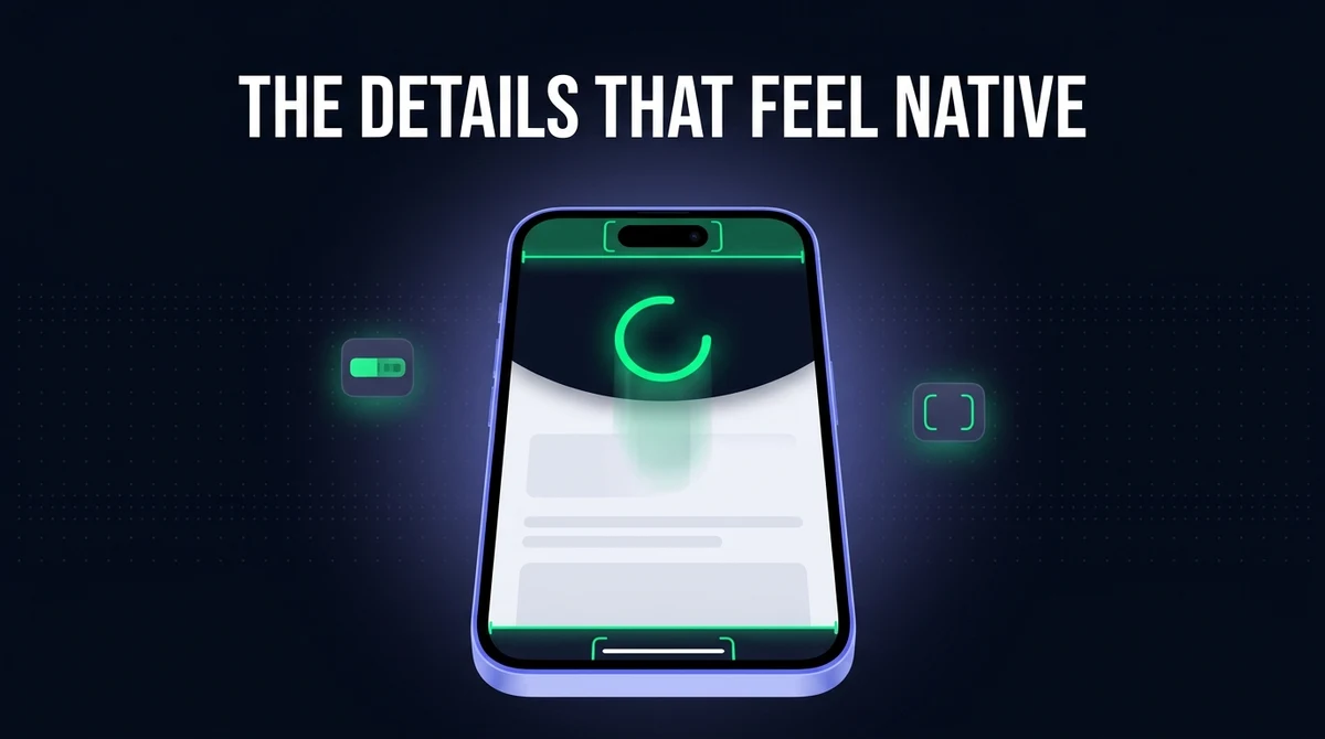
Pull-to-Refresh, Status Bar & Safe Areas: Native Touches That Sell a WebView App
Nobody opens an app and thinks "nice safe-area handling." They think "this feels cheap" — and then they leave. The gap between a WebView app that feels native and one that feels like a bookmark is four or five small details, none of which require touching your website's code.
Pull down and nothing happens. A grey status bar clashing with your brand. Your logo half-hidden under the notch. A bottom tab bar sitting under the home indicator. Each is a two-minute fix, and together they are the whole difference.
Why Does My WebView App Feel Like a Website?
A WebView app feels like a website when it skips the native shell conventions users expect — pull-to-refresh, a themed status bar, and content that respects the notch and home indicator. These are shell-level settings, not website changes.
| What users notice | What's actually missing | Where it's fixed |
|---|---|---|
| "Pulling down does nothing" | No pull-to-refresh gesture wired up | Native shell |
| "The top bar is the wrong colour" | Status bar left at the system default | Native shell |
| "My header is under the notch" | Safe area insets not applied | CSS on your site |
| "The bottom button is cut off" | No padding for the home indicator | CSS on your site |
| "Tapping flashes a grey box" | Default tap highlight left on | CSS on your site |
Two of those five live in the native shell and three live in CSS. That split matters: if you are having an app built for you, the shell items are the builder's job, and the CSS items are yours. AppOfWeb includes pull-to-refresh and status bar customisation in every paid tier, so the shell half is handled — but the safe-area CSS is on your site, and this guide covers both. If you are new to how the wrapper works at all, start with what a WebView app actually is.
How Do You Add Pull-to-Refresh to a WebView App?
Pull-to-refresh is added in the native shell, not in your website — Android wraps the WebView in a SwipeRefreshLayout, and iOS attaches a UIRefreshControl to the WKWebView's scroll view. Neither requires a line of JavaScript on your site.
The implementation is short on both platforms, but there is one condition that catches almost everyone:
| Platform | What you attach | The catch |
|---|---|---|
| Android | SwipeRefreshLayout wrapping the WebView | Only enable it when the WebView is scrolled to the top |
| iOS | UIRefreshControl on webView.scrollView | Same — and it fights with rubber-band bounce if left unchecked |
The condition is the whole trick. If pull-to-refresh is always enabled, then every time a user swipes down mid-article to scroll up, the page reloads instead. That is worse than having no pull-to-refresh at all, because it destroys their scroll position without being asked. Gate the gesture on the WebView's vertical scroll position being zero, and the problem disappears.
Quick diagnostic: scroll halfway down a long page in your app and swipe downward. If the page reloads, the scroll-position check is missing.
One more decision worth making deliberately: what "refresh" should actually do. Reloading the current URL is the obvious choice and is almost always right. Sending the user back to the home page is not — it looks like a crash. And if your site is a single-page app that manages its own history, a full reload may throw away in-page state, so test the gesture against your real routes rather than just the landing page.
How Do You Change the Status Bar Colour in a WebView App?
The status bar is controlled by the native shell, and the theme-color meta tag on your website does not control it inside a WKWebView or an Android WebView. That meta tag works in mobile browsers, which is exactly why people assume it will work here.
There are two separate things to set, and getting one without the other is the usual half-finished result:
- The background colour behind the status bar. This should match your site's header, not sit as a grey or black strip above it.
- The colour of the icons in it — the clock, battery and signal. These are only ever light or dark, and picking the wrong one makes them vanish against your header. A dark header needs light icons; a light header needs dark icons.
That second point is the one that gets shipped broken. A brand with a white header and light status bar icons has an invisible clock and battery indicator, and it looks like a rendering bug rather than a choice.
Check both themes. If your site has a dark mode, the correct status bar icon colour flips with it. A status bar configured once for the light theme will have unreadable icons for every dark-mode user. Our guide to dark mode in a WebView app covers how the theme reaches your content in the first place, and the launch flash that comes with it.
What Are Safe Areas, and Why Is My Content Under the Notch?
The safe area is the part of the screen not covered by the notch, the Dynamic Island, the rounded corners or the home indicator — and your content lands underneath them unless your CSS explicitly accounts for it. This half is fixed on your website, not in the shell.
Two pieces are required, and the first is the one people miss:
1. Opt in with the viewport meta tag. The safe-area values are only exposed once the page declares that it wants to draw edge to edge:
<meta name="viewport"
      content="width=device-width, initial-scale=1, viewport-fit=cover">
Without viewport-fit=cover, the inset values read as zero and every rule below silently does nothing — which is why "I added the CSS and it didn't work" is the most common report here.
2. Apply the insets in CSS using the env() function, always with a fallback value so desktop browsers and older devices behave:
/* A fixed site header, clear of the notch */
.site-header {
  padding-top: env(safe-area-inset-top, 0px);
}

/* A sticky bottom bar, clear of the home indicator */
.bottom-tabs {
  padding-bottom: env(safe-area-inset-bottom, 0px);
}

/* Landscape: clear the rounded corners and camera housing */
.content {
  padding-left: env(safe-area-inset-left, 0px);
  padding-right: env(safe-area-inset-right, 0px);
}
The four insets are top, bottom, left and right. Add them as padding on the elements that touch the screen edges, rather than as a margin on the body — padding keeps your header's background colour extending under the status bar, which is the look you want. A margin leaves a strip of blank page above it, which is the look you don't.
Landscape matters more than you'd expect. The left and right insets are zero in portrait and non-zero in landscape on notched devices. A layout tested only in portrait will clip its edges the first time somebody rotates the phone.
If you are working out which devices have which cutouts, our guide to iPhone screen resolutions and sizes covers the hardware side of the same problem.
What Changed in 2025–2026
The biggest change is on Android: apps targeting SDK 35 are drawn edge to edge by default on Android 15, and the old status bar colour API no longer has any effect. Apps that previously set a status bar colour and never thought about insets can regress visually just by raising their target SDK.
Three things worth knowing as of September 2026:
- Android 15 enforces edge-to-edge for apps targeting SDK 35. Your content now draws behind the status and navigation bars by default, so insets must be handled rather than assumed.
Window.setStatusBarColoris deprecated and ignored for these apps — the colour now comes from what your content draws there. This ties directly into the Google Play target SDK 35 requirement, which is why a lot of apps hit both at once. - Gesture navigation is the default on both platforms, which means the home indicator area at the bottom is permanent, not optional. A bottom bar without
safe-area-inset-bottompadding sits under a system gesture zone, so taps near it get swallowed. - Dynamic Island widened the top inset on the devices that have it. Hard-coded pixel values for notch clearance — which were always a bad idea — are now visibly wrong on current hardware. Use
env(), never a magic number.
The practical takeaway is that insets moved from a nice-to-have to a requirement. Edge-to-edge is no longer something you opt into on Android; it is what you get.
Bounce, Tap Highlights and Long-Press Menus
Three small CSS defaults are responsible for most of the remaining "this is a web page" tells: the overscroll bounce, the grey flash on tap, and the long-press callout menu on images. All three are one-line fixes, and all three should be applied selectively rather than globally.
| Tell | Fix | Apply it to |
|---|---|---|
| Page bounces past the end and reveals a blank strip | overscroll-behavior-y: contain | The scrolling container |
| Grey box flashes when a link is tapped | -webkit-tap-highlight-color: transparent | Buttons and nav links |
| Long-pressing an image opens a save/copy menu | -webkit-touch-callout: none | Decorative images only |
| Long-pressing UI selects the text like a document | user-select: none | Chrome and buttons only |
Be careful with the last two. Disabling the callout on every image stops users saving a product photo they actually wanted. Disabling text selection on body copy stops them copying an address, a code, or a quote — a genuinely hostile thing to do, and one that will show up in reviews. Apply user-select: none to your navigation, tab bar and buttons, and leave article text alone.
If you remove the tap highlight, replace it with something. A tap that produces no visible feedback at all reads as a broken button, so pair -webkit-tap-highlight-color: transparent with an :active state that changes the background or scales the element slightly. The goal is a deliberate response, not no response.
What Happens When the Keyboard Opens?
When the on-screen keyboard opens, it covers the bottom of the screen, and any fixed-position element anchored there — a bottom tab bar, a sticky "Add to cart" button — can end up floating above the keyboard or hidden behind it. This is the least-tested part of a WebView app and one of the most visible when it breaks.
The behaviour differs by platform and by how the shell configures window resizing, so the reliable approach is to test rather than reason about it. Two things help in practice:
- Hide sticky bottom chrome while an input is focused. Listening for
focusandbluron form fields and hiding the tab bar in between avoids the whole class of problem, and it is what most native apps do anyway. - Scroll the focused field into view yourself. Automatic scroll-into-view is inconsistent inside a WebView, particularly on long forms. A
scrollIntoViewcall on focus is a cheap safety net.
A checkout form where the keyboard hides the submit button is a conversion problem, not a cosmetic one, which is why this deserves a real device test alongside the session persistence checks covered in our previous guide.
Step-by-Step: Adding the Native Touches
Do the CSS half first, because you can verify it in a desktop browser before an app build exists. Six steps, and the first two have to come before the rest.
Add viewport-fit=cover to your viewport meta tag
Without it, every env(safe-area-inset-*) value reads as zero and the rest of the safe-area work silently does nothing.
Pad your edge elements with env() insets
Top inset padding on the fixed header, bottom inset padding on any sticky bar, left and right insets on full-width content for landscape. Always include a fallback value.
Set the status bar background and icon colour in the shell
Match the background to your site header, then choose light or dark icons for contrast against it. Set both, and set them again for your dark theme if you have one.
Wire up pull-to-refresh, gated on scroll position
SwipeRefreshLayout on Android, UIRefreshControl on the WKWebView scroll view on iOS — enabled only when the WebView is scrolled to the very top.
Tidy the touch defaults selectively
Contain the overscroll, remove the tap highlight and replace it with an :active state, and disable the long-press callout and text selection on chrome only — never on article text.
Test with the keyboard open
Focus an input on your longest form and confirm the submit button is still reachable and no sticky bar is stranded above the keyboard.
How Do You Test This Properly?
Safe areas and status bars cannot be verified on a desktop browser or a non-notched device, because the insets you are trying to handle are zero there. A layout that looks perfect in responsive mode can still be sitting under a Dynamic Island.
- Test on a device with a cutout — a notch or Dynamic Island on iOS, a punch-hole camera on Android. Insets are zero on hardware without one, so it will pass regardless.
- Rotate to landscape. The left and right insets only become non-zero here, and this is where edge clipping shows up.
- Scroll halfway down, then swipe down. The page should scroll, not reload. If it reloads, pull-to-refresh is missing its scroll-position check.
- Toggle dark mode. Confirm the status bar icons are still readable against the header in both themes.
- Open the keyboard on your longest form and confirm the submit button is reachable.
- Check the bottom bar against the home indicator, and tap the outermost buttons. If a tap near the bottom edge does nothing, it is being intercepted by the system gesture area.
None of this needs a device lab. One current iPhone and one current Android phone cover the cases that matter, and the whole pass takes about ten minutes. The same real-device discipline applies to file downloads in a WebView app, where simulator behaviour also differs from real hardware.
Common Mistakes
Hard-coding notch padding as a pixel value
A fixed padding-top: 44px was wrong the moment the Dynamic Island shipped and will be wrong again on the next redesign. Use env(safe-area-inset-top), which the OS keeps correct for you.
Adding the safe-area CSS but forgetting viewport-fit=cover
The insets return zero without it, so the CSS appears to do nothing and usually gets deleted as "not working." Check the meta tag first.
Enabling pull-to-refresh everywhere
Without a scroll-position check, swiping down mid-page reloads and destroys the user's place. This is more annoying than having no pull-to-refresh at all.
Setting the status bar background but not the icon colour
A white header with light icons hides the clock and battery entirely. Both values have to be set, and both have to flip for dark mode.
Disabling text selection on the whole page
A blanket user-select: none stops users copying an address, an order number or a discount code. Restrict it to navigation and buttons.
Frequently Asked Questions
Pull-to-refresh is added in the native app shell rather than on your website. On Android you wrap the WebView in a SwipeRefreshLayout, and on iOS you attach a UIRefreshControl to the WKWebView's scroll view. The important detail on both platforms is to enable the gesture only when the WebView is scrolled to the very top, otherwise swiping down in the middle of a long page reloads it and throws away the user's scroll position.
Because theme-color is honoured by mobile browsers, not by an embedded WebView. Inside an Android WebView or an iOS WKWebView, the status bar belongs to the native app shell around your content, so it has to be set there. This catches people out precisely because the same meta tag does work when the site is opened in Chrome or Safari on the same phone.
Because your content is drawing edge to edge without accounting for the safe area. The fix has two parts, and missing either one produces the same symptom: add viewport-fit=cover to your viewport meta tag so the inset values are exposed at all, then add padding-top using env(safe-area-inset-top) to whatever element sits at the top of the screen. Applying the CSS without the meta tag is the most common version of this problem.
It tells the browser to lay your page out across the entire screen including the areas behind the notch and home indicator, and in doing so it makes the env(safe-area-inset-*) values available to your CSS. Without it the page is laid out inside the safe area automatically and all four inset values report as zero, which is why safe-area CSS appears to have no effect until the meta tag is corrected.
Both, and Android has become more demanding recently. Apps targeting SDK 35 are drawn edge to edge by default on Android 15, so content draws behind the status and navigation bars whether you planned for it or not, and the older status bar colour API no longer takes effect for those apps. Punch-hole cameras and gesture navigation bars mean Android devices have meaningful insets of their own, so the same env() based CSS should be applied for both platforms.
They are almost certainly sitting inside the system gesture area around the home indicator, which intercepts touches before your page receives them. Add padding-bottom using env(safe-area-inset-bottom) to any fixed or sticky bottom bar so its buttons sit above that zone. This is easy to miss because the buttons look fine on screen and only fail when tapped, and it does not reproduce on older devices with a physical home button.
Only on interface elements, never on content. Applying user-select: none to your navigation, tab bar and buttons stops the awkward text highlighting that makes an app feel like a document, which is worth doing. Applying it to the whole page stops users copying an address, an order number or a discount code, which is genuinely frustrating and tends to show up in reviews. The same restraint applies to disabling the long-press callout on images.
Key Takeaways
- Pull-to-refresh and the status bar are shell settings; safe areas and touch defaults are CSS on your site. Know which half is whose.
viewport-fit=coveris the prerequisite — without it every safe-area inset reads as zero and your CSS does nothing.- Gate pull-to-refresh on the WebView being scrolled to the top, or mid-page swipes will reload and lose the user's place.
- Set the status bar background and its icon colour, and flip the icon colour for dark mode.
- Android 15 draws apps targeting SDK 35 edge to edge by default, so insets are now mandatory rather than optional.
- Never hard-code notch padding, and never disable text selection on article content.
These details are what separate an app users keep from one they delete after a week — the same category of polish as a properly designed splash screen and a real offline state. They also matter for review: an app that looks like an unmodified website is exactly what Apple's Guideline 4.2 exists to reject, and the gap between a thin wrapper and a real app is covered in our WebView versus native comparison. If you are building the shell yourself, our Android Studio WebView guide covers where these settings live in a real project.
Want the Native Touches Without Building the Shell?
AppOfWeb builds your website into native Android and iOS apps for a one-time fee — with pull-to-refresh and status bar customisation included in every paid plan.
Get Your Free Demo →